Q & A
About Dr. Samuel Ackerman
Dr. Samuel Ackerman is a data science researcher at IBM Research, Haifa. Currently, he is focused on statistical and ML analysis for improving hardware verification systems, and providing general statistical consulting within IBM. Sam received his Ph.D. in statistics from Temple University in Philadelphia, PA (2018), where his thesis research involved applying Bayesian particle filtering algorithms to analyzing animal movement patterns. Previously to IBM, he worked as a research assistant at the Federal Reserve Board of Governors (Washington, DC), and as an instructor in business math at Temple.
Sam welcomes any feedback on the topics discussed below, as well as any suggestions for questions or topics people would like to see discussed, especially if they could be beneficial to the general IBM community. Please use the email link to the right.
Question 01: I have a sample of values of a random variable. I want to conduct statistical inference on the variable based on the sample, for instance to construct a confidence interval for the value or estimate its distribution, while making as few statistical assumptions as possible. What can I do?
Answer:
We have a sample of values of a random variable. The beginning assumption we must make is that the values are iid (independent and identically-distributed). The independence assumption is standard and fairly reasonable. These assumptions mean that the sample values are actually representative of the distribution of the random variable (which is unknown, but must be inferred from the sample).
A confidence interval is an interval of values of the variable (typically two-sided, such as (-1.5, 6.5)) with an associated level of confidence (between 0 and 1, but typically a high value, such as 0.9, 0.95, 0.99, if this interval is to be useful). The interval is a useful summary and says that we expect the variable X to be within the interval values, say, 95% of the time. The confidence intervals many people are familiar with rely on the Central Limit Theorem (CLT), which uses the normal distribution. However, we want to avoid making distributional assumptions, because intervals based on the CLT sometimes make assumptions that are too rigid in practice.
A density estimate consists of saying “the probability that X takes on value x is p”. Sometimes, it is reasonable to assume X (approximately) takes a particular parametric form, such as normal distribution, Poisson, Gamma, etc. In this case, the appropriate parameter values can be estimated from the sample. However, it is often the case that observed values do not follow a known (or simple) parametric form, and hence we may want a more general (non-parametric) method. A non-parametric density estimate typically means calculating a discrete approximation of the true density by taking many points x in the domain of the distribution (the range of allowed values) that are spaced closely together, and calculating the density at each. For instance, say X takes values between 0 and 4 (based on the observed sample), then we may specify a discretization at x=0, 0.01, 0.02,\dots, 3.98, 3.99, 4.0, and estimate the density at each point. Density estimation is implemented in functions such as R’s “density”, and in Python in statsmodels.api.nonparametric.KDEUnivariate; the discretization is usually chosen automatically in the software.
Bootstrapping is a commonly-used technique of non-parametrically estimating the density (which can then be used to construct a confidence interval) of a variable based on a sample of values of the variable. This is particularly useful if the sample is small (< 30 as a good rule of thumb) or if there is no reason to assume a particular distribution of it (for instance, the values can be a set of R^2 measures from regressions or accuracy scores of a model when applied to independent datasets).
Bootstrapping is implemented in R in the “boot” package, and in Python in scikits.bootstrap.
Say the sample consists of N values \{x_1,\dots,x_N\} of the variable X. We want to estimate the distribution of an arbitrary statistic S(X) of the variable X. If we want to estimate the distribution of X itself, we might have S be mean(X), for instance. The distribution of X is approximated by repeated resamplings of the values of the given sample. Since we don’t have access to the full distribution of X (otherwise we wouldn’t need to do this), we only use the values we have, but any statistical inference needs to be adjusted to reflect this.
The most basic form of the bootstrap consists of forming a large number R (say, a few hundred) draws of the same size N with replacement from the original sample \{x_1,\dots,x_N\}. Let r_j,\: j=1,\dots,R, be the j^{\text{th}} resampling of \{x_1,\dots,x_N\}; since resampling is done with replacement, we expect there to be repeated values of various values x_i in r_j, while some values x_i may not be drawn at all. Since we assume \{x_1,\dots,x_N\} is a random sample of X, typically the values x_i are drawn with equal weights \{w_i\}=\{w_1,\dots,w_N\}, where each w_i =1/N. However, if there is reason to assume particular values of x_i in the original sample are “more important” (for instance, maybe that x_i a classification accuracy based on a larger underlying dataset than the others), then w_i may be adjusted to reflect this.
Let s_j = S(r_j) be the value of the statistic on resampling r_j. The set \{s_1,\dots,s_R\} can thus be used to perform inference on S’s distribution. Since the R resamplings are done independently and in the same way, the values \{s_1,\dots,s_R\} are equally-weighted.
Note on the performance of bootstrapping: Bootstrapping can be computationally intensive if R or N are large. Typically, N is relatively small, and R is larger. These factors should be taken into account when considering bootstrapping.
Confidence intervals for S based on bootstrapped values \{s_1,\dots,s_R\}
Say we want to construct a 95% confidence interval for S based on \{s_1,\dots,s_R\}. The most naïve approach would be, as with the CLT normal intervals, to assume the distribution of S is symmetric, and thus our interval should be (s_{(0.025)}, s_{(0.975)}), where these are the 2.5th and 97.5th empirical quantiles of \{s_1,\dots,s_N\}; notice \textrm{Pr}\left(s_i \in (s_{(0.025)}, s_{(0.975)})\right) = 0.95, since 0.95=0.975-0.025. In Python’s “bootstrap”, this is implemented in ci=“pi” and in R, as type=“perc”.
A similar but still naïve approach is to form a “high density interval” (HDI) of a given confidence level, say 0.95. The “best” interval is the interval that is shortest among those of fixed confidence; if the distribution is symmetric, this corresponds to the symmetric “percentile” one. The HDI uses the set \{s_1,\dots,s_R\} and finds s_{(a)} and s_{(b)} such that the empirical probability between them is 0.95 and s_{(b)} – s_{(a)} is the smallest possible (tightest such interval). This is implemented in R in the HDInterval package and in Python under stats.hpd.
A better approach is the bias-correction adjusted interval (“bca”, which is the default in the Python implementation). The naïve approaches treat the bootstrapped statistic values \{s_1,\dots,s_R\} as if they have the same empirical distribution as the same statistic S(X)’s population distribution (if we could just draw unlimited X and calculate S(x)). But this is not really true, so bootstrap estimates need to be adjusted to approximate the true population distributions. The bca approach does not assume symmetry, and uses additional jackknife sampling from the original data (making N subsets, leaving one out each time). For this reason, it becomes computationally expensive to calculate the bca interval on larger samples.
Question 02: What are good ways to represent text documents (long or short) as features for model-building?
Answer:
First, a brief background: Often, we want to perform analysis on a series of texts, such as calculating similarity between them for clustering, or building a classification model based on shared words. Usually this is based on analysis of the words in a document, and a matrix representation is used where each row corresponds to a document, and each column to a word in the vocabulary, so the words are model features.
In many applications, significant text processing is required. For instance, we usually remove stopwords (common words like “and”, “the”, which don’t give any special information about the text). Typically, lists of common stopwords in different languages are available in software implementation. Also, stemming is done to reduce the feature space by trimming words down to their “stems”. For instance, “working”, “work”, “worker”, “works”, are all related, and may be shortened to the same word “work” by removing suffixes. Text parsers also have rules to determine what is a “word” by parsing punctuation marks, space, etc. Here, we will not deal with these issues, and assume the user has done any necessary pre-processing.
In a given row of a matrix, usually a word’s column is zero if the document does not contain the word, and nonzero if it does. Usually, the matrix is sparse (most of the entries are 0-valued) because the set of possible words used (which usually determines the number of columns) is large relative to the number of unique words (number of nonzero entries) in each document. That is, each document typically only has a small subset of the possible words. Furthermore, most documents will only share few words, if any.
Measuring similarity
However, the number of shared words may be important in determining similarity between rows. Therefore, it is common to use distance measures like cosine distance for texts, as opposed to the more common Euclidean distance. This is because 0-valued entries in rows mean the word is not present. If two documents both have 0s in many of the same columns (remember, the matrix is sparse, so this will happen a lot), and Euclidean distance will treat these rows as similar. However, we want to measure similarity based on the number of shared words relative to the total number of words that appear in at least one of the documents, as opposed to relative to the whole vocabulary size, as in Euclidean distance. This is what cosine distance does, by taking the dot product (product of entries in columns that were nonzero/present for both documents), relative to the magnitudes of the vectors (related to only the nonzero entries in each).
Matrix encoding
There are a few options for document encoding. Expressing each word as a feature or column is called one-hot encoding. Depending on the modeling goal, you may choose to encode a row entry as binary (either the word appears, or not), or as the frequency the word appears in the document. One particularly popular one is TF-IDF (term frequency-inverse document frequency). This means that a word’s entry depends on how often it occurs in the document (term frequency) but accounting for how often that word appears overall in the whole set of documents, or “corpus” (inverse document frequency). Recall, models usually succeed by identifying the important words that tell us a lot about documents, and these tend to be the more infrequent words. So, words that have high frequency but appear often in the corpus, such as “the”, aren’t very useful at all, but if a word appears often in one document but is overall infrequent, it is important for that document. Thus, two documents that share the same relatively infrequent word many times (e.g., two documents that refer to “photosynthesis” a lot are likely to be related). Keep in mind that what is a common word depends on the corpus, so while “cell” may be an infrequent word in newspapers, in a medical journal many documents will contain this word, and thus it will be of less importance in comparing documents. In the medical journal, all documents are already of the same “medical” category, but we may need to differentiate between more-narrow sub-categories.
TF-IDF is implement in Python’s sklearn module, where the vectorizer automatically learns the vocabulary from a corpus of texts, and constructs the matrix encoding. This is just the basic idea, but there are more specialized modifications of the algorithm.
Feature Hash encoding
- There are several drawbacks of TF-IDF and other one-hot encoding methods:
- If they are used to, say, predict or cluster with new documents that have any words that have not been seen before, and thus have not been encoded to features, the model will not work. This is because the number of matrix columns is determined by the number of unique words in the training corpus. You could just add new 0 columns to the original matrix, but this is not ideal.
- If new documents are added to the training corpus (with no new words), the matrix entries have to be recalculated because the frequencies of the words in the corpus (document frequency) has changed. We wish to avoid extra recalculation when new data is added.
The first drawback may be the more serious, because you want to keep your model useful in the face of new data.
Hash functions provide one good approach. Feature hashing is similar to one-hot encoding except that the user first (before training a model) specifies the number of columns in the data matrix. Typically, this has to be a big number, often around a million or so. It is best to have it be 2 raised to some integer power. On the one hand, a larger matrix needs to be constructed, but the hash function allows new features to be mapped to the existing space, thus allowing new words and documents to be incorporated without having to completely rebuild the model.
Briefly, what is a hash function? Hashes map objects into a span of existing space (here, for instance, the space of columns) in a “hidden” way. For instance, when you construct a dict object in Python (the equivalent in Perl is a hash object), the keys are stored in an order determined by a hash function, not in the order you created them. Say you enter the following commands:
#create dict
tmp = { "hello": 2, "world": 3 }
tmp.keys()
#dict_keys(['hello', 'world'])
print(tmp.keys()[ 0 ]) #try to access the first key, you may expect “hello”
#TypeError: 'dict_keys' object does not support indexing
print(list(tmp.keys())[ 0 ])
#'hello'
Trying to access the keys by their index doesn’t work, since the order of internal storage doesn’t mean anything. You should access them just by iterating over tmp.keys() rather than over the indices.
Feature Hash encoding in Python
Feature hashing is implemented in Python in sklearn.feature_extraction.FeatureHasher. It uses the MurmurHash algorithm to assign indices. The following example is given in the documentation above:
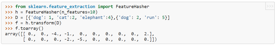
Here, dictionary D contains two “documents”, one of which has the words (“dog”,”cat”,”elephant”), the second has (“dog”,”run”). Each word is represented as a dict key, with the value being the frequency of the word in the document. “h” is initialized as a hash with 10 features (notice we recommend that the number of features be an exponent of 2, due the values being positive or negative, which here 10 is not). f is the resulting 2xn_features array where D is encoded according to h. Each word gets mapped to a column: here elephant -> column 2, dog -> column 3, run -> column 4, cat -> column 9. Notice that in this simple case, there are no collisions, since each word gets mapped to its own column (feature). For a fixed vocabulary size (here, 4), the fewer the number of features, the more likely there are collisions. For n_features =4…9, there are still no collisions, but obviously setting n_features =3 (< vocab size) forces a collision. We would get the matrix
array([[-1., 2., -4.],
 [-2., -5., 0.]])
This means that the “run” (=-5) and the “cat” (=2) words have been assigned to the same feature (a collision of assignment), which means we have lost the information of them being two different words. The values are assigned either negative or positive values so that in the event of collisions, there will be some cancellation of values so that a feature doesn’t artificially get higher weight by getting more values assigned to it when there is a collision.
Generally, the number of hash features needs to be set much higher than the number of words, to reduce the number of collisions. If the number of words is known to be small and of fixed size, one-hot encoding may be better than hashing. The blog article contains some good mathematical experiments relating the number of features and expected collision.
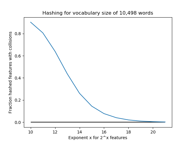
Below, we conduct an experiment with a vocabulary size of 10,498 “words”. For n_features = 2^k for k=10,…,21, we use FeatureHasher to assign these words to features. For these values k, the number of features are [1024, 2048, 4096, 8192, 16384, 32768, 65536, 131072, 262144, 524288, 1048576, 2097152]. The fraction of collisions is (10,498 - #features)/10,498. Notice that for k=10,…,13, n_features < 10,498, so there are guaranteed to be a large number of collisions (at least 50%). We see that increasing the number of features exponentially quickly lowers the number of collisions, so perhaps 2^18=262,144 or so is enough for this application. But in this case, we could have done one-hot encoding and saved a lot of storage space.
Question 03: I have some data I am monitoring over time. It is possible that there will be some change to the data, and I want to detect this change. I also want to have statistical guarantees about the accuracy of my decision, but want to make as few assumptions about the data as possible. What is the correct way to formulate this problem?
Answer:
We will begin by describing a general formulation and discussing some of the general issues that occur in sequential hypothesis testing. Then, we show how our formulation can be extended to applications such as detection of changes when data arrive in batches, or if you want to detect change relative to some withheld baseline sample.
- Basic setup:
- Let t=1,\dots,T be indices of time
- Let X_t be some univariate value observed at t
- We want to conduct a statistical test of a “changepoint”, meaning that for some index k\in \{2,\dots,T\}, X_k (or some subset \{X_k,\dots,X_{k+j}\}) is significantly different from the preceding set \{X_1,\dots,X_{k-1}\}.
Statistical guarantees
What do we mean when we say we want a statistical guarantee about when we declare a change has happened? Typically, we can never be absolutely sure about a decision, but we can quantify the degree of confidence in it, say 95% that we are correct (or, less than 5% incorrect); this allows us to make a good statistical decision.
Now, what does it mean for a decision to be “wrong”? We have to make a decision between “no change” (“negative”) or “change happened” (“positive”). A mistake happens if either
- A change has not happened, but we said it did (“false positive” declaration, also called a “Type 1 error”)
- A change happened, but we failed to say it did (we declare “negative”, which is not true, so this is a “false negative”, also called a “Type 2 error”)
- At some time k < T, we make a final declaration that a change has occurred. We stop the process here, and do not observe the rest of X_{k+1},\dots,X_T to be able to re-evaluate our decision.
- We reach t=T without declaring a change, in which case we say, “no change has occurred”.
- A single hypothesis test (e.g., two-sample t-test) is based on assuming you observe a complete (pre-specified) sample of size N (in our case, T), and make a single decision, whose Type-1 error is controlled at a pre-specified level α.
- If you prematurely, at n<N, “peek” at the data by conducting a hypothesis test on the data up to that point, then deciding if the data appear to be significantly different, you are likely to make a mistake. Why? This individual test might be okay, but if you repeatedly perform the test, each of which has probability α of false positive, and the change occurs at some k, the probability of making at least one mistake is much higher, more like 1-(1- \alpha)^k (approximately). See this article for additional explanation.
Typically, in statistical hypotheses, since the “negative” represents the status quo, we want to protect against a false positive mistake more than a false negative. For instance, if monitoring a computer network, “positive” might mean a hack has happened. However, every time we declare a hack has happened, this may have serious consequences (e.g., spending time and money investigating). Therefore, typically we want to have a guarantee of the form “if there has been no change (‘negative’), we have only a 5% chance of making a mistake by declaring a change has occurred (‘positive’)”. Obviously, we also want to make sure that if a hack has happened (‘positive’), we have a guarantee that we have not missed it (‘negative’), that is, the reverse. However, it is usually easier to guarantee the first condition. This is called controlling the false positive or Type 1 error probability.
What does it mean to conduct the test sequentially?
At each time t, we must make the decision “yes or no, based on the data X_1,\dots,X_t, so far, has a change occurred?” We will assume that one of the following happens, either:
A Type-1 error occurs if we declare time t=k to be a changepoint, but either (1) a change occurs at a later t > k, or (2) a change does not occur before T. Both are equivalent in our case, because we do not observe the data after k, and we assume we don’t look into the future. We want to control the probability of this mistake to be below some value α (say 0.05, or 5%). If a change has occurred at a time t, we also want to detect it as quickly as possible (i.e., declare at k, where k – t is as small as possible, but we can’t have k < t or this would be a mistake).
Why do I have to consider a special method for sequential change detection?
Data change point detection is essentially a distributional modeling problem, where a change is defined as a change in the distribution of the data, perhaps relative to some fixed point, or relative to the most recent values. Consequently, how you detect a change depends on how you model your data (univariate vs multivariate, parametric vs nonparametric, is data arriving in batches or not, etc.). You may think that, say conducting a set of standard hypothesis tests vs some fixed baseline X_0, one at each point in time, say a two-sample t-test, is valid if you want to control your overall probability of making a mistake. (To conduct a t-test, you need samples rather than single points anyway, an issue we will discuss below).
A key point is that sequential decision-making is fundamentally different than combining a sequence of standard non-sequential (meaning, they don’t take time into account) hypothesis tests, as above. This is for a few reasons:
Essentially what we need to do in a proper sequential test is to be able to “look” back at the data at each time t, while simultaneously guaranteeing that if we make a decision that change has happened, there is only a 5% (or so) chance that change has not happened. That is, this guarantee applies over all times t, but that this guarantee exists at the single time we make a decision. This property can be verified by generating simulated data repeatedly (e.g., 1000 times) from the process, with the same time of change, and you should see that in approximately 5% of runs, if a change point is identified, it will be a false positive, before the actual change point. One way this method might work is by having the hypothesis test decision thresholds shift over time, as opposed to the standard non-sequential methods, in which the thresholds stay constant.
cpm package for R
One particular implementation of a sequential detection method that is (1) nonparametric, (2) univariate, and (3) offers solid sequential statistical guarantees is the cpm (change point model) package by Gordon Ross (2015). A package overview is given in the article “Parametric and Nonparametric Sequential Change Detection in R: The cpm Package” (Ross, 2015), and the theory is outlined in “Two Nonparametric Control Charts for Detecting Arbitrary Distribution Changes” (Ross and Adams, 2012).
The following summarizes the key points of the article:
We consider sequential detection as a sequence of hypotheses at times t, where
h_t is the hypothesis test decision threshold at time t, for the hypothesis:
H_0: {no change happened as of time t yet} vs H_1:{change happened at some k < t}
At each t, a statistic W_t or D_t (the authors allow use of either a Cramer von Mises or Kolmogorov-Smirnov nonparametric distribution distance measure) is calculated for the hypothesis test at time t. Let’s assume W_t for now (CvM), but the same applies for the KS measure. The statistic W_t represents the result of looking back at all past times k < t, and seeing which k* is the most unusual (and hence the best candidate for a change point, if it indeed happened already, which is unknown). Our sequential test is then determined on the basis of the sequence of \{W_1,\dots,W_t\}. If at some t, the W_t appears to be unusual relative to the previous values (how we determine unusual will be discussed below), then we say that the distribution of data seems to have changed.
The key part here is that the hypothesis test thresholds h_t depend on time. This allows all of the following probabilities to hold at a constant α at all times (Equation 2 in the paper):
\text{P}(W_1 > h_1\mid \text{\underline{no change at 1}}) = \alpha and
\text{P}(W_t > h_t \mid W_{t-1} \le h_{t-1}, \dots\text{ and } W_1 \le h_1,\text{ and \underline{no change before t}}) = \alpha for all t
If W_t > h_t, we decide there has been a change as of time t. But the premature detection error probability at t (i.e., that W_t > h_t when a change has not occurred yet), given that you have reached t without detecting so far (i.e., W_k < h_k for all times k< t), holds at \alpha for all t by virtue of the thresholds h_t changing over time. This is the Type-1 error probability guarantee we are seeking. Keeping h_t constant (e.g., \pm 1.96 for \alpha=0.05), as the naïve non-sequential approach suggests, would result in many false detections since h_t (if left free to vary) would rise above the constant value.
Types of change detection in cpm:
The cpm method detects change points by unusual changes in the values of W_t or D_t relative to the previous values. The good thing is that this implementation allows for various methods of measuring distributional difference. If you know what type of change to expect at a change point (e.g., change in X_t mean, variance, etc.), you can choose the metric that is most sensitive to those.
The basic function form is detectChangePoint(x, cpmType, ARL0=500, startup=20, lambda=NA).
Here x is the data stream of X_t. The argument cpmType is the metric for determining change. Options like “Student” or “Bartlett” detect mean and variance changes, respectively, and “Kolmogorov-Smirnov” and “Cramer-von-Mises” can detect more general changes, though they will be slightly slower to detect, say, a change in the mean. Note, the KS and CvM here refer to methods of detecting a change in the W_t or D_t statistics, and not the methods to construct W_t or D_t themselves, referred to earlier.
As an additional note, the method requires an initial burn period, before which it cannot detect a change, since it needs a big enough sample of \{W_t\} to establish a typical baseline. This is specified by the parameter “startup” (default=20, also the minimum value). The significance is that \alpha=1/\text{startup}, so in this case the default \alpha=0.05 as is typical. Essentially, to control Type-1 error at a lower rate, you have to have a longer startup period, for instance 100 for \alpha=0.01.
How cpm can be adapted to drift detection vs a baseline sample
The above general discussion of the cpm package formulates detecting change points by differences among the sequence of data \{X_1,\dots, X_t\} observed up until each time point t. We would like to adapt this setup to where we have a baseline sample \{X_0\} and we want to detect drift (divergence) by comparing \{X_1,\dots,X_t\} (production data) to this baseline. Recall here thatx_iare assumed to be univariate.
We can reformulate this by assuming that our observed data is actually some Z_1,\dots,Z_{T*}, which we consider in batches of fixed size m. For instance, the j^{\text{th}} batch is Z_{j*m},\dots,Z_{j*(m+1)-1}. Let T*=T\times m for simplicity, such that the windows of size m exactly cover the data \{Z\}. Let’s assume the baseline sample is a set of values \{Z_0\}; this sample does not have to be of size m.
One way to identify drift is to see not whether the production data \{Z\} seem to be different than the baseline sample \{Z_0\}, but whether the nature of their difference changes. It is reasonable to assume that the Z data at the beginning of production are similar to the baseline.
Let \text{Dist}(a, b) be some distance measure between samples a and b, such as Wasserstein or CvM distance. It’s better if this is the measure itself, and not, say, the p-value for a hypothesis test based on the measure, which is a less powerful indicator. Then, let the values \{X_1,\dots,X_T\}, on which we actually perform the sequential test, be
X_t = \text{Dist}\left(\{Z_0\} \:,\quad \{Z_{t*m},\dots,Z_{t*(m+1)-1}\}\right)
that is, the distance between the baseline and the t^{\text{th}} batch of Z. This distills the t^{\text{th}} batch of Z into a single value. The reason we have considered the data originally in batches is that an effective distance metric of comparison with the baseline can only be calculated if the data are samples and not single values. Drift can be indicated by whether the distance metric suddenly changes in value, assuming that similar values of distance will describe similar production batches (i.e., that it is a sensitive measure). Probably the best way to detect such a change is through a sequential t-test, which will be sensitive to changes in the mean value of the distance metric (which itself is a nonparametric measure of distance between the samples, rather than being based on the mean of the samples, so that it can capture arbitrary changes in the data).
Question 04: I have two samples, each representing a random draw from a distribution, and I want to calculate some measure of the distance between them. What are some appropriate metrics?
Answer:
The correct approach is to use a distance metric that is nonparametric, and takes into account the shape of the distributions estimated by the samples.
We also assume that the two samples, denoted \{x\} and \{y\}, are of arbitrary sizes n_x and n_y, and represent random draws of two random variables X and Y, respectively. The fact that we allow the sample sizes to differ means that we will not consider situations of paired data samples, where, by definition n_x=n_x=n; for instance, there are n individuals and \{x\} and \{y\} consist of 1 observation for each individual. One example is where \{x\} and \{y\} represent pre- and post-treatment measurements on each individual in a clinical trial. In this case, a test such as paired t-tests can be used.
A further assumption is that we want a symmetric measure. Symmetry means that \text{dist}(x,\: y)=\text{dist}(y,\: x),\:\: \forall x, y, so the order of which sample we compare to the other does not matter. By definition, distances must be symmetric (though some do not satisfy the triangle inequality requirement necessary to be metrics). There are other classes of distributional comparison measures, such as divergences. Kullback-Leibler divergence, for instance, is an information-theoretic measure that measures the amount of information, or entropy, lost when using one distribution instead of another. These measures are not generally symmetric. For more information, see this article.
We will consider several situations: (1) univariate continuous, (2) rank-based comparison of univariate continuous samples, and (3) multivariate data.
1: Distances between univariate continuous-valued samples
- Kolmogorov-Smirnov (KS): Consider a random variable X with density (distribution) function f_X. The cumulative distribution function (CDF) of X is denoted F_X, and is defined as F_X(x)= \text{Pr}(X \leq x). The KS statistic calculates the distance between two random variables X and Y as \text{sup}_z |F_X(z)-F_Y(z)|. That is, it is defined as the greatest absolute value difference between the CDFs of the two random variables over their domains. Here, F_X and F_Y can be the empirical CDFs from the two samples \{x\} and \{y\}, or one or both of them can be the CDF of a specific parametric distribution. Thus, it can be used as a goodness-of-fit measure to see if a sample appears to be distributed similar to, for example, a normal distribution. The KS distance is bound in the interval [0,1], and is the basis of a statistical test to decide if two distributions are similar enough (e.g., if two samples may come from the sample distribution). While the KS statistic can measure arbitrary differences in distribution, it is also known to be conservative (i.e., it requires a larger amount of data to detect differences).
- Anderson-Darling (AD) and Cramer von-Mises (CvM): The AD statistic is similarly based on distances between the CDFs (F(x)) of distributions, and like the KS statistic, can be used as a goodness-of-fit test between a sample and a given parametric distribution. Compared to KS, it is known to achieve good results with less data, and thus the test converges more quickly. The AD statistic uses a weighting function w(x) on the values x of distributions. The weights tend to put more emphasis on differences at the tails of the distributions. The CvM distance is a special case in which all the weights are equal. However, the values of the statistics are not very interpretable. The two-sample AD test (i.e., for measuring distance between two samples) is a relatively new innovation, and is implemented in software such as scipy.stats.anderson_ksamp (an extension to k>1 samples); here, the normalized statistic is returned, not the actual distance. This paper compares performance of KS and AD tests.
- Wasserstein (earth-mover’s) distance: Wasserstein distance (WD) is a metric that can be used for both univariate and multivariate arbitrary samples. Imagining each sample’s distribution as a pile of dirt, WD is interpreted as the total distance needed to move each grain of dirt from one pile to form the other pile (taking into account the shape and shift of each distribution). For this reason, it is often called “earth mover’s distance”. In R, this is implemented in the “transport” package under functions “wasserstein1d” and “wasserstein” (for higher dimensions, which appears to require equal sample sizes). In Python, scipy.stats.wasserstein_distance implements the 1-D case. The 2-D empirical distance is implemented in ot.emd (ot=“optimal transport”, emd=“earth mover’s distance”). Also, ot.gromov.gromov_wasserstein and ot.gromov.entropic_gromov_wasserstein compute an extension of this method, called Gromov-Wasserstein, which allows the dimensions of the two samples to differ.
- Total variation distance (TV): The L-1 norm of a vector is the sum of the absolute values. For two samples, the TV distance is ½ the L-1 norm of the difference in their densities. The TV distance is restricted in [0,1]. However, it is known to be sensitive, in that two samples that appear to have similar shapes may have a large distance according to this measure.
2: Distance between distributions in terms of ranks
This method uses the empirical samples observed, but unfortunately it does not reflect changes in magnitude at the edges (much like the median of a sample is not affected if the largest values increase), which affects the empirical distribution, but not the relative ranks of observations. It can thus be used for ordinal data. The rank of a value x in a set is the index it appears in when the values of the set are ordered in ascending order. By an analogy, let \{x\} and \{y\} represent the finishing times of racers in two teams, where a lower value of rank means faster time. If the two teams are equal in skill (i.e., these two sets are iid samples from the same distribution), when \{x\} and \{y\} are pooled and the values ordered, and the ranks 1,\dots,(n_x+n_y) calculated, we expect the ranks of the two groups to be roughly evenly mixed among the values \{1,\dots,(n_x+n_y)\}.
The Mann-Whitney U test is a test of this hypothesis. The resulting statistic U calculates the amount of one set’s ranks that are larger than the other. In the test formulation, this statistic, when normalized with its mean and standard deviation, has an asymptotically normal distribution. When U is divided by the product n_x\times n_y (i.e., the total number of pairwise comparisons), giving a measure denoted \rho, we get a value that is in [0,1]. Depending for which variable X or Y U is calculated, this represents the value \text{Pr}(X>Y) + \text{Pr}(X=Y) (or the complement) if they are discrete-valued, and just \text{Pr}(X>Y) for continuous-valued variables (since \text{Pr}(X=Y)=0 in this case).
This measure has the interpretation of the overlap in distributions (with direction), which is different from the overlap in density functions. A value \rho=0.5 (i.e., U is half of n_x\times n_y) means there is basically perfect overlap in distributions, since one variable is equally likely to be larger than the other. This corresponds to zero distance. A value of \rho\approx 1 means X is almost certainly larger than Y, so the distance is large. If U is taken to the minimum of the U-measure calculated with respect to the two variables (call these values U_1 and U_2), then rescaled here, you get a directionless distance measure. This measure is developed as a(X,Y) in “The area above the ordinal dominance graph and the area below the receiver operating characteristic graph” (Journal of Mathematical Psychology) by Donald Bamber.
A quick R illustration is as follows:
#generate random draws
nx <- 100
ny <- 300
x <- rnorm(n=nx, mean=0)
y <- rnorm(n=ny, mean=1)

#name the vectors so we keep track of
#which value came from which variable
names(x) <- rep("x", nx)
names(y) <- rep("y", ny)

#combined vector keeps the names of the values
combined <- c(x, y)
nc <- names(combined)

#sequence of “x”,”y” in order of the values
nc <- nc[ order(combined) ]

#U-statistic is, for each member of x and y,
#how many of the other variable it is lower than,
#then take the sum
U1 <- sum(vapply(which(nc == "x"), function(ii) sum(nc[ ii:length(nc) ] == "y"), 1))
U2 <- sum(vapply(which(nc == "y"), function(ii) sum(nc[ ii:length(nc) ] == "x"), 1))
U <- min(U1, U2)
U
#perform Mann-Whitney test, “W” should be the same as U above
wilcox.test(x, y, alternative="two.sided")
#estimate of Pr(X > Y)
#should be >0.5 since x2 has higher mean
rho <- U/(nx*ny)
rho
3: Multivariate data distance measures
- For multivariate data (even d=2), the idea of comparison across dimensions is difficult to define, which is why many of the univariate metrics above cannot be extended easily to multivariate data. For instance, the CDF, the basis of the KS/AD/CvM measures above, is defined for a vector \boldsymbol{x}=[x_1,x_2,\dots,x_d] as F_X(\boldsymbol{x})=\text{Pr}(X_1\leq x_1\text{ and }X_2\leq x_2\dots\text{ and }X_d\leq x_d). That is, the CDF is the probability on a vector of values \boldsymbol{x} is the probability that all dimensions are simultaneously \leq their respective values of x. The notion of being larger or smaller on “almost all dimensions” is not well-defined at least in this respect, and thus defining the distance of X from Y across multiple dimensions d in terms of the differences between their CDFs is difficult. Furthermore, there is the problem that multivariate density estimation from a sample suffers from the curse of dimensionality, under which distances in high dimensions often do not do well in representing distributional differences. Nevertheless, there are several options:
- Wasserstein distance: As mentioned above, Wasserstein distance is an intuitive measure of the “effort” to move the mass of one distribution to the other, and thus of the distance. It is defined on univariate as well as multivariate data. However, in higher dimensions, Wasserstein distance is known to have high computational cost.
- Maximum Mean Discrepancy (MMD): MMD is a measure that is becoming popular in the ML literature due to its application to many different domains (e.g., text and images), not just numeric data. MMD uses various kernel functions, which can be customized to the domain. A kernel function basically is a way of expressing belief about the distance or relationship that can be expected between two vectors; that is, the distribution of the distance. It serves as a way of embedding the sample \{x\} in a distribution space. A common example is Gaussian kernel between vectors \boldsymbol{x} and \boldsymbol{y}, which takes the form k(\boldsymbol{x},\: \boldsymbol{y})=\exp{\left(- \frac{\|\boldsymbol{x} - \boldsymbol{y}\|^2}{\sigma}\right)} . See http://www.gatsby.ucl.ac.uk/~gretton/papers/testing_workshop.pdf (slides 10-11) for an illustration. The formula for an empirical estimation of MMD from samples \{x\} and \{y\} is k(\boldsymbol{x},\boldsymbol{y})=\frac{1}{n_x^2}\sum_{i=1}^{n_x}\sum_{j=1}^{n_x}k(x_i,x_j) + \frac{1}{n_y^2}\sum_{i=1}^{n_y}\sum_{j=1}^{n_y}k(y_i,y_j) -\frac{2}{n_x n_y}\sum_{i=1}^{n_x}\sum_{j=1}^{n_y}k(x_i,y_j). On a technical note, this formula has a small bias because it includes k(x_i, x_i) and k(y_j,y_j), for which the distance is 0, and thus Gaussian Kernel is 1.
#example of manually calculating MMD
#create 3-dimensional uniform random draws of size 100 and 70
#dimensions should be the same
nx <- 100
ny <- 70
x <- matrix(runif(3*nx), nrow=nx, ncol=3)
y <- matrix(runif(3*ny)+1, nrow=ny, ncol=3)

#R function to calculate MMD between x and y, using
#Gaussian kernel (rbfdot=radial basis Gaussian function,
#the default) with sigma =1

library(kernlab)
mmdo <- kmmd(x, y, kernel=rbfdot, kpar=list(sigma=1))
mmdo

#the important value here is the first order MMD statistics
#which is the estimate of the MMD^2
mmdstats(mmdo)[ 1 ]

#functions to compute Euclidean distance and Gaussian Kernal
euc <- function(a,b) {
  sqrt(sum((a-b)^2))
}

gkern <- function(x,y,sigma=1) {
  exp(-1*(euc(x,y)^2)/sigma)
}

#MMD is calculated by taking the kernel function across all
#pairs of x and y with themselves (including the kernel of a value
#with itself, which here becomes 1 because the distance is 0 and we
#take the exp) and with each pair of x and y values
#then we take the sum across each

kxx <- sum(vapply(1:nx, function(ii) sum(vapply(c(1:nx), function(jj)
	gkern(x[ ii, ], x[ jj, ]), 1)), 1))
kyy <- sum(vapply(1:ny, function(ii) sum(vapply(c(1:ny), function(jj)
	gkern(y[ ii, ], y[ jj, ]), 1)), 1))
kxy <- sum(vapply(1:nx, function(ii) sum(vapply(1:ny, function(jj)
	gkern(x[ ii, ], y[ jj, ]), 1)), 1))

#calculate the expected value (empirical mean) by dividing
#by the number of pairwise comparisons
mmd_est <- (1/(nx^2))*kxx + (1/(ny^2))*kyy - (2/(nx*ny))*kxy
print(“manual calculation”)
sqrt(mmd_est) #turns out to be mmdo
print(“kernel test”)
print(mmdo)
The crucial aspect of using kernel methods (whether in this application or in general), is that a kernel function k(\boldsymbol{x}, \boldsymbol{y})=\phi(\boldsymbol{x})^T\phi(\boldsymbol{y}), where \phi is a mapping function of inputs \boldsymbol{x} into some feature space, usually higher or infinite-dimensional, and the single value returned by the kernel represents the dot product the respective outputs of the vector \phi. For instance, if k(\cdot,\cdot) is some function that can be represented by an infinite Taylor expansion, such as the exp function, then \phi is an infinitely-long vector, each element of which is some function of the input \boldsymbol{x}, such as the positive integer powers of x (by the Taylor expansion), each of which we can consider as a feature transformation. The new feature space is the collection of all these transformations. The key part is that the kernel can use the results of this infinite-dimensional space \phi by using the kernel function, without having to explicitly compute all of the component features. Kernel methods can be used in classification problems to create classification boundaries in a transformed feature space when separability is impossible in the original space. The output space of the kernel function in the case of MMD is called a reproducing kernel Hilbert space (RKHS). See slides 9-11 of http://www.gatsby.ucl.ac.uk/~%20gretton/coursefiles/lecture5_distribEmbed_1.pdf for an illustration. See https://stats.stackexchange.com/questions/152897/how-to-intuitively-explain-what-a-kernel-is and https://stats.stackexchange.com/questions/69759/feature-map-for-the-gaussian-kernel for additional details about kernels. The technical details about kernels are not necessary to understand the MMD.
Question 05: I have multiple independent distributions (i.e., random variables), or multiple independent samples (i.e., draws from random variables). I want to estimate the distribution of some combination of these. How do I do this?
Answer:
Estimating the distribution of a combination of samples or random variables is very straightforward, if independence can be assumed. We will begin by illustrating the reverse problem, that of estimating a mixture density model on a single density.
Mixture models: De-constructing a density into components
Say you have a density function, typically one that is estimated based on a sample of values (histogram). These densities are often multimodal and “bumpy”, so they cannot be represented as a single parametric density. You want to express the overall density as being the weighted combination of several other densities. Possibly, each of these component densities represents a sub-group of items.
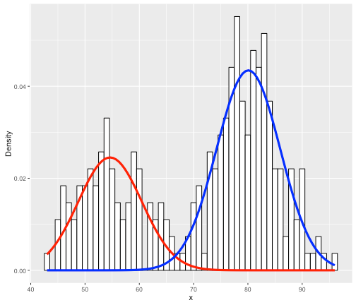
For instance, say your data are the grades (0-100) on a final exam from students at a university, (see the histogram below). Clearly, it is bimodal. We want to construct the overall grade density as being constructed from several, perhaps two, separate densities. Typically, you must specify the parametric form of the components, usually Gaussian/normal. This is called building a finite (since there are a finite number of components) mixture model for your data. In the image below, you can see that the histogram can be approximated as a combination of blue and red normal density functions. Here, the blue peak is more prominent, so that component would receive a higher weight. All density functions must have area=1 under them, but here the component densities appear as different sizes because they are differently-weighted, to better line up with the curvature of the data they represent.
- There are several reasons you may want to do this:
- It is possible that the components may actually represent distinct sub-populations, say, classrooms 1 and 2, where the grade performance is significantly different between them, so they are represented by different distributions. Maybe you want to try to reconstruct the group memberships by the mixture, then see if this corresponds to actual group membership.
- More likely, your data represents some type of true population distribution, which you want to model. The total data density cannot be modeled as single parametric distribution, but can be modeled as a (weighted) mixture of parametric densities, such as normal distributions. That is, the mixture serves as a parametric approximation of the density, but the components do not necessarily represent sub-groups, rather just help approximate the density’s shape.
There are some more recent methods to deconstruct data into a finite mixture of unspecified densities. See for instance R’s mixtools package (https://cran.r-project.org/web/packages/mixtools/vignettes/mixtools.pdf , page 10-12). However, this is a more complicated problem, and can potentially be dangerous because of overfitting.
Constructing a combined density from known components
More often, you have several samples or densities that you want to combine into a single density function. This differs from the case discussed above because you already have separate groups to combine, rather than having the combination, which you want to split into meaningful or imaginary components based on the shape. If you have samples, one may think the natural approach would be just to pool the samples, perhaps with sample-specific weights, into a single histogram, for which you can compute a nonparametric density estimate (e.g., in R, the density() function or Python’s statsmodels.api.nonparametric.KDEUnivariate) see first question above, without estimating each density separately first.
However, there are many cases in which rather than pooling the data from different samples, you may want to model the density of each sample separately (either parametrically or not), and then combine them. In this way, particularly if each sample is modeled by a parametric distribution (perhaps there is a good reason to do so, such as in Bayesian applications), you estimate the overall density as a weighted mixture of the group densities. This is similar to the component mixtures discussed above, except that the density is estimated as a mixture of known components (which may be meaningful if the samples represent groups) rather than estimating the components that form a given mixture, which may not be meaningful. Typically, “mixture distribution” means estimating a density as a combination of sub-component densities, whereas we will use “combined density” to refer to a variable or density estimated as a weighted sum of random variables whose distributions are known.
Luckily, calculating a density from a weighted sum of its known components is very easy, with the crucial assumption that your component densities represent independent random variables. This is a very reasonable assumption if they represent independent sample or groups.
In general, say you have n random variables X_1,\:X_2,\dots,\:X_n. Each variable X_i has a known density function f_1,\:f_2,\dots,\:f_n, which may be of different parametric forms. For the following, we will assume each f_i is a parametric density function that can be evaluated at any value in its domain, but it can also be a density estimate at a discretization of the domain (e.g., if the domain is \[0,1\], then we estimate f_i at 0, 0.01, 0.02,\dots,1), which is assumed to be the same for all \{f_i\}. If the \{f_i\} have different domains (e.g., normal is defined on the real line, but gamma variables must be >0), construct a discretization on the union of the domains.
Let w_1,\dots,\:w_n be a vector of normalized weights for these n variables, where in the default case each w_i=1/n. Then, we can form a random variable X=\sum_{i=1}^n w_i X_i, which is the weighted mean of the variables, and its density is likewise represented by the weighted sum of the densities, f_X=\sum_{i=1}^n w_i f_i. Its mean \mu_X and variance \sigma_X^2 can be easily calculated as a weighted sum of the means (\mu_i) and variances (\sigma_i^2) of the n random variables, as \mu_X=\sum_{i=1}^nw_i \mu_i and \sigma_X^2=\sum_{i=1}^n w_i^2 \sigma_i^2. This is true for any independent random variables by the linearity property of the mean and variance (see http://www.stat.yale.edu/Courses/1997-98/101/rvmnvar.htm).
While the weighted mean X will always have the mean and variance above, in certain cases it will also have a known parametric form. For instance, if each X_i\sim\text{N}(\mu_i, \sigma_i^2) and they are independent, then X\sim\text{N}\left(\sum_{i=1}^n w_i\mu_i, \quad \sum_{i=1}^n w_i^2 \sigma_i^2\right), as above. Other random variables, such as Gamma, have similar, though more restrictive, such properties (see examples for different distributions). More likely than not, the expression f_X=\sum_{i=1}^n w_i f_i will not have a single parametric form.
Calculation example with Beta distributions
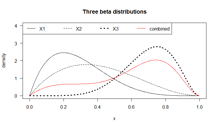
Let each X_i be a Beta-distributed random variable (with domain between 0 and 1), which is defined by two parameters \alpha_1 and \alpha_2 (also denoted \alpha and \beta, in R called shape1 and shape2). Below we graph three (n=3) Beta distributions with different parameters, in black. Say we have a weight vector w_1=0.2, \:w_2=0.1,\: w_3=0.7 (note \sum_{i=1}^{n} w_i=1), representing the relative importance of these variables. The combined density function, plotted in red, represents the weighted average of these three variables. The bumpiness of the combined density depends both on the relative density values of the f_i at given values of the domain, as well as the values w_i of the weight vector.
#weight vector
w <- c(0.2, 0.1, 0.7)
#discretization of the domain space [0,1]
dp <- 0.001
p <- seq(0, 1, by=dp)

plot(x=p, y=dbeta(p, shape1=2, shape2=5), type="l",
     main="Three beta distributions", ylab="density", xlab="x",
     ylim=c(0,4), las=1)
lines(x=p, y=dbeta(p, shape1=2, shape2=3), lty=2)
lines(x=p, y=dbeta(p, shape1=7, shape2=3), lty=3, lwd=3)
legend("topleft", lty=c(1:3,1), lwd=c(1,1,3,1), col=c(1,1,1,2),
    legend=c(paste("X", 1:3, sep=""), "combined"), horiz=TRUE)

#combined density expression as sum of individual betas
comb_dens <- function(p) {
  w[ 1 ]*dbeta(x=p, shape1=2, shape2=5) +
  w[ 2 ]*dbeta(x=p, shape1=2, shape2=3) +
  w[ 3 ]*dbeta(x=p, shape1=7, shape2=3)
}
#plot combined density
lines(x=p, y=comb_dens(p), col="red")

#check it approximates a density
sum(comb_dens(p)*dp)
#0.9999994
Since the function f_X=\sum_{i=1}^n w_i f_i, similarly its value at any point 0\leq x\leq 1 is f_X(x)=\sum_{i=1}^n w_i f_i(x). This is an exact expression, not an approximation. It cannot be simplified further, since unlike the other distributions, there is no parametric expression for a sum of Beta distributions with arbitrary hyper-parameters (clearly the red curve above is not Beta-distributed, for instance). The approximation comes when we discretize the domain \[0,1\] with gap \Delta=0.001 at x=0,\: 0.001,\: 0.002,\dots,\: 0.999,\: 1. When we conduct calculations, say an integral over the combined density function f_X, approximated by a discrete (Riemann) sum with bin width \Delta, we should get approximately 1 (densities must sum or integrate to 1 across their domain). These calculations will be good approximations, if we have specified a fine enough discretization, and that the density is not too bumpy/sharp or approaching infinite values (asymptotes) anywhere in the domain (for Beta, this can happen at the domain endpoints).
comb_dens <- function(p) {
  w[ 1 ]*dbeta(x=p, shape1=2, shape2=5) +
  w[ 2 ]*dbeta(x=p, shape1=2, shape2=3) +
  w[ 3 ]*dbeta(x=p, shape1=7, shape2=3)
}
Application to estimating combined success probability
What is an application for this? Say that you are a gambler playing three different games: (1) poker, (2) blackjack, and (3) roulette. Ignoring how much money you win at each game, let’s just consider your win probability distribution for each.
(Side note: Each time you play a game, you either win or lose, so it’s a binary random variable. Instead of simply taking the empirical proportion (\hat{p}=\frac{\&hash;&space;\text{wins}}{\&hash;&space;\text{times&space;played}}) as an estimate for the unknown true win probability p, typically p is treated as a random variable and its distribution is estimated. In many cases, p is estimated by a normal distribution centered around \hat{p} (by the Central Limit Theorem), but since we must have 0\leq p\leq 1 by definition, in Bayesian settings usually the Beta distribution is used, along with a prior distribution on p. This is more sensible since it works with samples of any size (unlike the normal approximation, which is only accurate above a certain minimum), and the domain of the Beta (\[0,1\]) matches the range of values of p, which it is trying to estimate, unlike the normal, whose domain is all real numbers.)
Let X_1,\:X_2,\:X_3 be random variables, whose distributions express our uncertainty of the win probabilities p_1,\:p_2,\:p_3 of each game. p_1,\:p_2,\:p_3 are unknown, but can be estimated by playing each game multiple times and counting the relative numbers of wins/losses for each. X_1,\:X_2,\:X_3 will be modeled as Beta-distributed, as noted above. Each time a game is played, the hyper-parameters \alpha_1 and \alpha_2 of each X_i are increased; this means that the more we play a given game, the more information and certainty we have about the respective p_i, and the variance of X_i will decrease. Thus, the density f_i of X_i depends not only on the relative proportion of wins/losses in each game, but also tends to get more concentrated the more you play. The image shows that since X_3 has more of its distribution to the right than the other two, you are more successful at roulette than poker or blackjack.
Now, given the estimated densities, the weights w_i may represent the fraction of bets played on each game (i.e., your preferences). This means, since w_i=0.7, you play 70% of all your bets at roulette. Then the combined distribution X=\sum_{i=1}^n w_i X_i would represent the distribution of your probability of winning at a randomly chosen game (given the weights). That is, since it is more likely that you will be playing roulette than a different game, the distribution of X more heavily reflects the distribution on X_3, roulette. Notice that the red density is bimodal and does not have a single parametric form, other than its expression f_X=\sum_{i=1}^n w_i f_i.
Once we have a density expression for f_X, we can do anything with it we would do with any density function. For instance, we can compare two players with different success probability distributions X_i and weights w_i, and compare them overall on their win distributions, perhaps with a distribution distance function.
Question 06: I want to construct a confidence interval (CI) for a statistic. Many CI formulas are calculated in a form similar to "\text{value} \pm 1.96\times\text{standard deviation}" When is it appropriate to use these, and how do I figure out which one to use?
Answer:
First, some background: a statistical or machine learning (ML) procedure often involves estimating certain parameters of interest. For example, in a linear regression, the values of slope parameters \beta, and the \text{R}^2 or the regression, are of interest. Confidence intervals (CIs) are often used to give additional information about the variability inherent in an estimate, in addition to just the single value (point estimate) calculated from our data. In any given situation, we treat the parameter estimate as a random quantity (since it depends on the data we have, which is some random sample of the total population of interest), and thus, they have a theoretical statistical distribution, typically symmetric around the single value estimated. Many statistical significance tests for model parameters are based on the probabilities observed in the theoretical distribution conditional on the null hypothesis being true.
For instance, in linear regression, the null hypothesis for the test of whether a dependent variable X_k is significant in the regression is \text{H}_0: \beta_k=0, that its coefficient is on average 0. To decide if X_k is significant, we see how unusual its observed slope value is \hat{\beta_k}, where “how unusual” is defined according to the theoretical distribution, if in fact the average was \beta_k=0 (that is, that there is no linear relationship). The true population slope \beta_k is the one that would be measured if we conducted a regression on the full population of al values Y and X that exist (e.g., the regression of height Y on weight X for all members of the population). The observed slope \hat{\beta_k} from our sample is an estimate of \beta_k since we only have a sample of the population values, and thus it depends on the particular sample we have. A CI for \beta_k is constructed, centered around the estimate \hat{\beta_k}, and if 0 is outside of it, we reject the null hypothesis and conclude that the slope is not insignificant, that is, that it cannot be 0. Since the statistical test and the estimated CI are based on the same statistical assumptions, we need to be aware of which assumptions are made.
In a CI, we decide on a confidence level, which is a high number like 90%, 95%, or 99% (expressed as a decimal). Our CI would express the range of values that our parameter might take, say, 95% of the time. For instance, a regression might estimate the \beta_1 slope value as being -2.76, but say that 95% of the time we expect it to be between -2.8 and -2.72. The fact that this interval is short tells us that the estimate is stable and that we can be confident in our estimate. In the hypothesis test framework, the fact that the CI does not contain 0 (the hypothesized value under the null \text{H}_0) means that the slope is significantly different from 0.
A common default confidence level is 95%. Many people are familiar with a confidence interval that looks like “x \pm 1.96\times(\text{standard deviation})”. When is it appropriate to use these, and where do these numbers come from?
The sample mean
As mentioned above, typically we treat the parameter we would like to estimate as being unknown. To know it, we would have to have access to all the data (the “population”), which because it is so vast, is treated as impossible. A few examples:
- \mu is the mean income if we considered all working adults in the US.
- p is the fraction, considering all American voters who would vote for candidate X .
- \beta_1 is the slope parameter and \text{R}^2 is the coefficient of determination we would get on the regression of Y= “salary in dollars” and X= “years of work experience” for lawyers in the US, if we somehow had a dataset of these variables for all lawyers in the US.
In statistics, we treat these population parameters as unknowable. To learn about them, we take a (representative) random sample of size N, consisting of values \{x_1,\dots,x_N\}. Typically we would calculate the sample mean (“X-bar”), \bar{X}=\frac{1}{N}\sum_{i=1}^N x_i as the sample equivalent of the population parameter. Estimates of a parameter are often denoted with a \hat{\phantom{X}} (“hat”), so we would say, for instance, \bar{X}=\hat{\mu}, that is “the sample mean is our estimate for the parameter \mu”.
The fact that here we use the sample mean is crucial, because the sample mean has very nice statistical properties. Let’s take the case of estimating the population mean \mu, which in this case could represent the average income of working American adults. Therefore, each adult X_i in our sample is one randomly-drawn instance from the distribution of random variable X = “income of an American adult”. The term “expected value”, denoted E(\cdot), means, the average we expect a random variable to have. Therefore since \mu is the mean, the expected value is always E(x_i)=\mu. Assume for now that the population standard deviation is \sigma.
The following are true, no matter what the distributional form of X is:
- E(\bar{X})=\mu_{\bar{X}}=E\left(\frac{1}{N}\sum_{i=1}^N x_i\right)=\frac{1}{N}\sum_{i=1}^N E(x_i)=\frac{1}{N}\sum_{i=1}^N \mu=\frac{1}{N}(N\mu)=\mu
- Standard deviation of \bar{X}=\sigma_{\bar{X}}=\frac{\sigma}{\sqrt{N}} (the standard deviation of an estimator or statistic, such as \bar{X}, is also called a standard error)
The first formula shows that the sample mean \bar{X} has the same expected value as the mean \mu itself. Therefore, using the sample mean \bar{X} itself as a guess for \mu is a good idea; this is why many CIs are centered around the sample mean. The second formula, which we do not prove here, says that the standard deviation of \bar{X} (remember, it is a random variable depending on the sample we get) depends on \sigma, and as we get a larger sample (N is larger), the standard deviation decreases, meaning our value of \bar{X} is more and more likely to be close to the true, unknown \mu.
The Central Limit Theorem
Note, we have not said anything about what the population distribution is. Surely, since \bar{X} is a function of values X_i drawn from this distribution, its distribution should depend on that of X, and in order to make a CI, we have to have a distribution. The equations above are true for any X’s distribution. The good news is that, due to a theorem called the Central Limit Theorem, we can say that basically as long as we have a large enough sample N (typically at least 30), that the distribution of the sample mean \bar{X} has a normal distribution, with mean \mu_{\bar{X}} and \sigma_{\bar{X}} as given above, regardless of the underlying population distribution of X.
(Technical Note: Actually, if \sigma is not known (which is a more realistic assumption), it can be approximated by the sample standard deviation s, so the standard error \sigma_{\bar{X}} is estimated as \frac{s}{\sqrt{N}} rather than \frac{\sigma}{\sqrt{N}}. Then, the variable T=\frac{\bar{X}-\mu}{s/\sqrt{N}}, which standardizes \bar{X} around the unknown mean \mu, will have a T-distribution with degrees of freedom depending on the sample size (=N-1). If N is big enough, the T-distribution converges to standard normal, and assuming it is standard normal is a good enough approximation.)
If the statistic \bar{X} has a normal distribution, which is symmetric around the mean \mu and unimodal, the best CI for it is symmetric, and given according to quantiles of the standard normal distribution. In a standard normal distribution, 95% of the probability is between (-1.96, 1.96). Since \bar{X}\sim \text{N}(\mu_{\bar{X}}, \: \sigma_{\bar{X}}), the 95% CI for \mu by \bar{X} is \bar{X}\pm 1.96\sigma_{\bar{X}} = \bar{X}\pm 1.96\frac{s}{\sqrt{N}}. As mentioned, the distribution should technically be T rather than normal in the case of the sample mean where s replaces \sigma, but the normal distribution is easier to use in calculations and is an acceptable approximation for large enough samples.
This means that any statistic that can be expressed as a sample mean of a sample has the same property. For instance, say your data X_i are binary (X_i\in \{0,1\}), such as yes/no responses to a survey question. Here, \hat{p}=E(X_i)=\frac{1}{N}\sum_{i=1}^N X_i is the observed sample proportion of X’s equaling 1. In this case, p is the population parameter (e.g., the proportion of the population of voters that will vote for a particular candidate), which is estimated by the proportion \hat{p} in the sample. Since \hat{p} can be calculated as the sample mean of the binary X_i, it also has a normal distribution, with parameters \mu_{\hat{p}}=p and \sigma_{\hat{p}}=\sqrt{\frac{\hat{p}(1-\hat{p})}{N}}. The same is true of linear regression parameters \beta_k, except that technically a T-distribution should be used, especially if there are a large number of regressors, since their T-distribution degrees of freedom (=N-K) depends both on the sample size N and number of regression parameters K. However, again, if N is big enough, the normal distribution is an acceptable approximation.
(Side notes: (1) the estimate \hat{p} itself is used to approximate the standard deviation, so sometimes instead the standard deviation formula is \sigma_{\hat{p}}=\sqrt{\frac{0.5\times 0.5}{N}}, where 0.5 is used to give the most conservative (worst-case), since it maximizes \sigma_{\hat{p}} for a given N. (2) while by definition, p\in [0,1], the normal distribution has support on all real numbers, so it’s possible that the CI bounds for \hat{p} will be outside of [0,1]. One solution to this is to use Bayesian posterior intervals based on the beta distribution, which will be restricted to the correct domain, but will not typically be symmetric.)
However, the regression R^2 statistic cannot be expressed as a sample mean of independent draws. The same thing is true for order statistics or quantiles of samples, which are not sample means. Therefore, calculating a CI for them cannot be done by assuming a normal distribution. However, bootstrap sampling can be used to conduct nonparametric inference and calculate approximate CIs for these kinds of statistics. Bootstrap sampling uses repeated re-sampling from a fixed sample, calculates the statistic value for each re-sampling, then bases the CI and inference from those. Even though the data is resampled, each sample is independent of the others, so the statistic values in each sample are mutually independent, since its value in one sample will not affect the value in another. This allows for inference to be conducted, except that the estimated variance in bootstrapping needs to be adjusted to reflect the fact that the bootstrap samples, while independent, were from a fixed initial sample and not new (non-overlapping) samples from the original population.
Summary:
- Statistics calculated from our samples, such as quantiles, mean, regression R^2, etc., are random quantities, since they depend on the specific sample collected.
- We conduct inference on these calculated values to learn about the corresponding unknown population parameters that they approximate. A typical technique is to calculate a confidence interval (CI) for the value of the population parameter, which is based on the theoretical distribution of the value of the sample statistic across multiple hypothetical samples.
- If the desired statistic can be represented as a sample mean of underlying data, then if the sample is big enough, we can use the Central Limit Theorem result to say it has an approximately normal distribution. Then, we can use simple and convenient facts about the normal distribution to calculate a CI. Otherwise, we will generally need some other technique like bootstrapping.
Question 07: I have a fixed set of (named) objects, or a fixed table of class variable levels with fixed probabilities. I want to generate a random sample with replacement from my sample or of levels of the class variable, where the resulting relative frequencies most closely match the fixed sample or probabilities. What is a good way to do this?
Answer:
Let \mathbf{x}=\{x_1,\dots,x_k\} be a set of (without lack of generality) items of distinct value; these may be (distinct) numeric values or (distinct) categorical values, say names or levels of a categorical variable. Let \mathbf{w}=\{w_1,\dots,w_k\}, w_i \geq 0 \forall i be a set of weights on the corresponding object in \mathbf{x}. \mathbf{w} can be easily converted to probabilities by dividing each w_i by the sum, in which case this represents a discrete distribution over the values \mathbf{x}, but the weights need not be normalized. We would like to draw a random sampling of size N with replacement of objects x_i in \mathbf{x} according to the weights \mathbf{w}. In the default case, all w_i are equal (w_i \propto 1/k \forall i), in which case we are drawing an unweighted random sample, the usual case.
Random sampling with replacement (RSWR) proceeds by drawing one item from \mathbf{x} on each of j=1,\dots,N turns; when we replace the drawn item, the weights w_i don’t change after each sampling. On average (assuming that the weights w_i have been rescaled so they sum to 1) the number of times x_i will be selected (which is a random variable itself) is on average N\times w_i times, with variance N\times w_i \times (1-w_i). These values come from the fact that the number of times each object is selected jointly follow a multinomial distribution. The multinomial is a generalization of the binomial distribution to more than 1 dimension, where a draw consists of a vector of k elements of nonnegative integer values that sum to N, where the values are on average N times the weight value. The frequency counts for each value x_i are dependent because the total frequency must be N. Using a multinomial function to generate draws is shorthand for drawing one value each of N times with probabilities \mathbf{w}.
The problem is that although each x_i will be selected a number of times proportional to its weight (average = N\times w_i\propto w_i), the variance can be fairly high. For example, let k=3, \mathbf{x}=\{x_1,x_2,x_3\}, where x_1=0, x_2=1, x_3=2. Let standardized weights be w_1=0.27, w_2=0.13, w_3=0.6. Let us make N=53 draws (chosen purposely so N\times w_i is never an integer). The average number of draws for each is shown below:
x = [0,1,2]
w = [0.27, 0.13, 0.6]
N = 53
#expected number of draws for each
expected = [N*ww for ww in w]
print(expected)
#[14.31, 6.890000000000001, 31.799999999999997]
Let us conduct a large number of iterations of this process and tally the results:
import numpy as np

num_iter = 1000
#generate 1000 vector draws of size N with
multi_draws = np.random.multinomial(n=N, pvals=w, size=num_iter)
#display the first several rows
multi_draws[:8,]
#each row of the following is a 3-element frequency vector summing to N=53
#in total there are num_iter=1000 rows
#array([[20,  1, 32],
#       [14,  3, 36],
#       [13,  8, 32],
#       [21,  4, 28],
#       [11,  7, 35],
#       [15,  8, 30],
#       [10,  8, 35],
#       [13,  4, 36]])

#calculate summary statistics: mean, variance, min, and max
#mean
np.apply_along_axis(arr=multi_draws, axis=0, func1d = np.mean)
#array([14.32 ,  6.791, 31.889])
#the above are very close to the expected values [14.31, 6.890000000000001, #31.799999999999997]

np.apply_along_axis(arr=multi_draws, axis=0, func1d = np.var)
#array([ 9.9236  ,  6.115319, 12.452679])
#theoretical frequency variance:
#[N*ww*(1-ww) for ww in w]
#[10.4463, 5.994300000000001, 12.719999999999999]

np.apply_along_axis(arr=multi_draws, axis=0, func1d = np.min)
#array([ 6,  1, 19])

np.apply_along_axis(arr=multi_draws, axis=0, func1d = np.max)
#array([24, 18, 44])
In the above simulation, the average frequencies are as expected. However, the variances are very high. For instance, x_2, which had the lowest weight, is drawn at one point 18 times (33% of 53, when we expect it to be only 13%). Obviously, the large variance and gap between the minimum and maximum are related to the fact that we made a large number of draws, whereas on a single draw, the frequencies should be closer to the expected value. In many cases, however, we want the selection frequency of each item selected to be as invariable as possible, say, within the expected value N\times w_i rounded up or down.
A good technique for this is called low variance sampling (as opposed to the above, which had high variance). One version of this was proposed by James Edward Baker in his article “Reducing bias and inefficiency in the selection algorithm”, from Proceedings of the Second International Conference on Genetic Algorithms on Genetic Algorithms and Their Application (1987). A short function for this is as follows:
 def low_var_sample(wts, N):
	# ex: low_var_sample(wts=[1,4],N=2)
	xr = np.random.uniform(low = 0, high = 1 / N, size =1)
	u = (xr + np.linspace(start=0, stop=(N - 1) / N, num=N)) * np.sum(wts)
	cs = np.cumsum(wts)
	indices = np.digitize(x=u, bins=np.array([0] + list(cs)), right=True)
	indices = indices -1
	return(indices)
Now let’s repeat low-variance sampling for N times, and show a few examples:
lvs = [low_var_sample(wts=w, N=N) for ii in range(num_iter)]
lvs_freqs = [[list(lv_draw).count(ii) for ii in [0,1,2]] for lv_draw in lvs]
np.array([lvs_freqs[ii] for ii in range(5)])

#notice that the frequency counts vary only by one up or down
#array([[15,  6, 32],
#       [15,  7, 31],
#       [14,  7, 32],
#       [14,  7, 32],
#       [15,  6, 32]])

np.apply_along_axis(arr=lvs_freqs, axis=0, func1d = np.mean)
#array([14.319,  6.885, 31.796])
np.apply_along_axis(arr=lvs_freqs, axis=0, func1d = np.var)
#array([0.217239, 0.101775, 0.162384])
[N*ww*(1-ww) for ww in w]
#[10.4463, 5.994300000000001, 12.719999999999999]
np.apply_along_axis(arr=lvs_freqs, axis=0, func1d = np.min)
#array([14,  6, 31])
np.apply_along_axis(arr=lvs_freqs, axis=0, func1d = np.max)
#array([15,  7, 32])
Notice that the mean frequency counts are close to what is expected (14.31, 6.890000000000001, 31.799999999999997), but this time their variance is much lower. We see that the min and max frequencies observed only differ by 1, (e.g., between 14 and 15), so the observed numbers will essentially be the expected values rounded either up or down.
Here we explain the logic behind these results. The following illustration shows a different example with k=N=10 and different weights). An analogy is trying to throw darts at a dartboard such that the fraction of darts in each zone corresponds to the overall area fraction of each zone. RSWR corresponds to, say, N=1000 iid dart throws (with the same probability distribution of landing in a given place), which, if the distribution is not uniform on the space, will tend to be concentrated in given areas. Even if the distribution is uniform, as we have seen, since the draws are independent, there will be a fair amount of overall variability in repeated sets of 1,000 throws. Low variance sampling corresponds to throwing the darts in as fine and evenly-space a grid of locations as possible (that is, so the locations are not iid), to cover the board evenly.
The following rectangle has width 1. The partition into ten rectangles (vertical lines) is done so the width of rectangle i is proportional to weight w_i. Low variance sampling spreads the N draws across the interval [0,1] in an equally-spaced manner, since the draws are done “together” rather than independently as in RSWR. The only random element is an initial draw of xr uniformly on [0, 1/N], after which the remaining N-1 points are equally spaced with gap \frac{N-1}{N^2} (linspace function). The cumsum then maps these points to the bins representing the weights, so that we expect on average the frequency of points in the bins to be proportionate to the weight, and with low variance.
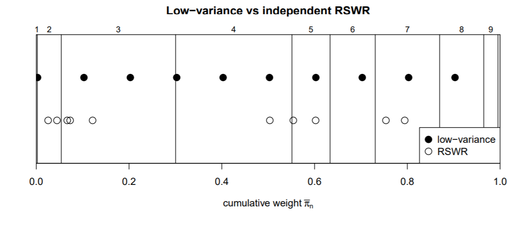
We have seen that low-variance sampling can be a good sampling technique. It can also be easily used as a side effect in applications when you want to generate a sequence of values (e.g., 0,1,2 in our example) according to pre-specified weights, when the weight values are not nice round numbers, and the frequencies have to add up to a fixed sum.
The following is a fairly contrived example, but something similar may arise in different applications. For instance, say you want to present the fractions [26/39, 3/39, 10/39] (which add up to 1) in percent form. If you multiply these numbers by 100 and round them, you get [67%, 8%, 26%], which add up to 101%, not 100%. It is very common in presenting tables of values with rounding errors to note that the numbers may not add up to 100% due to rounding. However, assume there is some reason we need the presented numbers themselves to add up to 100% exactly. We can perform ‘pseudo-rounding’ (which will not be the same as regular rounding because there is some randomness involved, which does not happen in regular rounding) by drawing an N=100 size low-variance sample with the weights \mathbf{w}=[26/39, 3/39, 10/39]. We then having the ‘rounded’ values be the frequency counts, which are guaranteed both to add up to 100 exactly, and to be the value of the weights rounded up or down, which we deem good enough for our purposes, even if it’s not technically correct. The longer the weight vector, the more ‘rounding errors’ will be made, so it may be better to, say, make 1000 draws and then display the frequencies divided by 10 with one digit after the decimal point allowed, which will still add up to 100.
w0 = [26/39, 3/39, 10/39]
s = np.round(100*np.array(w0))
#array([67.,  8., 26.])
np.sum(s)
#101.0

#one possible result, some randomness
#due to low variance sampling

from collections import Counter

lvs = low_var_sample(wts=w0, N=100)
result = Counter(lvs)
#Counter({0: 66, 1: 8, 2: 26})
#first weight is displayed as 66 rather than 67, the true rounding
s = list(result.values())
s
#[66, 8, 26]
np.sum(s)
#guaranteed to be 100
Question 08: I have a sample of data points that represent some population of interest. I would like a flexible method that is nonparametric that uses the observed distribution to determine if a given data point is an outlier (anomaly) relative to this distribution. How can I deal with this?
Answer:
Say we begin with a sample of data. This data can be multivariate, but for now let us assume it is univariate. Say we have another data point of the same dimension, and we want to determine whether it is an outlier (anomaly). This requires that we compare it somehow to the baseline data, since “unusual” is a quality that is defined relative to something else. What are some ways we could deal with this problem?
Basic concepts in outlier detection
Consider the following illustrative histogram of a sample of data with values between 0 and 25. Assume that the initial sample consists of the middle values between 5 and 10 only. The other data points \{0, 15, 20, 25\} are outliers because they are far away from the rest of the data between 5 and 10. So perhaps a way to approach this is to use the range (interval from minimum to maximum) of the existing data to characterize what is “typical”, so any point that is less than 5 or more than 10 is an anomaly. However, say we want to characterize the data value x=4, which is outside of this interval. This is naïve because 4 is close to 5, and is therefore less anomalous than, say, 20, which is further from the observed data, so we want a way to differentiate between these cases, that we are less sure that x=4 is an outlier. So simply saying that any points outside of the interval [5,10] are outliers can be naïve in some situations.
(Source: “Data outlier detection using the Chebyshev Theorem”-- Amidan, Ferryman, Cooley, 2005)
Better ways of dealing with this are to consider the shape of the distribution; a simple way relies on just the mean and standard deviation of the data. For instance, say the mean of the values between 5 and 10 is \mu=7 and standard deviation is \sigma=1. One could calculate the z-score (=number of standard deviations away from the mean) of each data point x under consideration, calculated as z=\frac{x-\mu}{\sigma}. Values x with z-scores close to the existing data will have (positive or negative) z-scores relatively close to 0, such as between -2 and 2 or so. The value x=25 would have z-score z=\frac{25-7}{1}=18, so it is very anomalous, and more anomalous than x=4, which has z-score=-3.
We have statistical theorems such as Chebyschev’s Inequality, which applies to any dataset without assumptions, and gives guidelines for how much of the data exists between a certain range of z-scores (that is, a given number of standard deviations from the mean). This can be used to set criteria for outliers based on the z-scores, if you have a desired maximum proportion of points you want to identify as outliers, since the theorem tells you the maximum proportion of z-scores that are expected to exceed given thresholds. If the data is known to be approximately normally distributed, we can quantify given tail probabilities (typically outliers will be in the tails) with more precision. A method such as z-scores is better than the above naïve in-or-out-of-interval approach since (1) it quantifies anomalous-ness, and (2) allows us to add a fudge factor to the range, so that we can include data points slightly outside of the observed range within the definition of “typical”. Another such example is specifying the acceptable interval using the quartiles (25th and 75th percentile of the observed data), plus or minus some multiple of the interquartile range (IQR=difference between these quartiles) on either side. This approach is often used in drawing boxplots and deciding how far the ‘whiskers’ of a boxplot extend.
Beyond the naïve approach
An approach such as z-scores often works but has several weaknesses. One is the difficulty of characterizing outliers in multidimensional space. One of the common approaches to multivariate data is to use Mahalanobis distance, which calculates distance of a vector-valued data point from the mean of each variable (centroid), taking into account the variances of each variable. Confidence ellipses (containing a given percent of the data) or the raw distances themselves from the center point can be used to score outliers. In the following bivariate illustration, say the outer blue ellipse contains 99% of the points. The four points in the upper right-hand corner could thus be outliers.

(Source: “Using Mahalanobis Distance to detect and remove outliers in experimental covariograms”—Drumond, Rolo, Costa 2018)
One problem is that the data we have may have an arbitrary distribution (e.g., not characterized well by ellipsoids), for which these techniques do not work well. Let us consider two problematic cases: asymmetry and multi-modality (multiple peaks) of the distribution.
Asymmetry and multi-modality
In the following illustration, let the blue histogram represent our observed baseline data. (Ignore here the fact that the variable revenue must be non-negative, and pretend it represents a distribution from an un-bounded real-valued variable). The value at x=140 is an outlier because it is far on the right tail. The blue histogram is quite right-skewed and asymmetric, however. The value x=140 is 45 units away from the next highest blue value (95). However, since the right side has a long tail, a distance of 45 units on the far right is less significant than, say x=-45, the same distance from the lowest value to the left. We could say, perhaps that x=-15 (only 15 unites below x=0) is as anomalous as x=140 (45 above), because the distribution is more concentrated on the left side. Therefore, a symmetric outlier criterion like z-scores (which use the mean and standard deviation, and therefore a z-score = k is as anomalous as -k) may not work here.
Now, consider a multi-modal distribution such as the following. Suppose this represents a density estimate of observed data, where the observed range is [400, 1400]. Even though x=775 (the valley just to the left of x=800) is observed here, and thus is within this interval, the distribution has fairly low density there, so we might consider it to be more anomalous than, say x=710, where the density is higher. This illustrates the fact that outliers can be within the interval of min-max of observed data, so determining if a point is an outlier simply by whether it is in some observed range is not necessarily a good idea.
(Source: https://stackoverflow.com/questions/27418461/calculate-the-modes-in-a-multimodal-distribution-in-r)
As an additional note, we point out that a density function (which can be estimated based on any empirical data) is a more statistically-valid measure than a histogram, for these purposes. A histogram is calculated by first dividing the observed range into fixed-width interval bins, then calculating the frequency within each bin. However, the histogram shape depends on the determination of the bin width (though there are algorithms to determine the “optimal” one). The density estimate is less dependent on this, and also can be compared across two samples for which the histograms have different bin widths. Therefore, using the density estimate at a point can be a better measure of how common that point is relative to a distribution.
Local Density Factors (LDFs)
The following describes the approach in the article “Outlier Detection with Kernel Density Functions” by Latecki, Lazarevic and Pokrajac. This article aims to determine outliers in a fixed sample of (possibly multivariate) values \mathbf{x}_i,\: i=1,\dots,n. This is done by estimating the density function at each point, using its pairwise distances to neighboring points; this is sensible because a low density value means there are few points that are close by. The key advantage of this approach is its generality, with the following key properties:
- The distance measure (used to define outliers) can be user-defined, so it is customizable. The distance measure is not required to satisfy the properties of being a metric; it must be non-negative and symmetric, but does not have to satisfy the triangle inequality, which a metric does.
- The underlying data can be univariate or multivariate, or of arbitrary domain, as long as a distance measure can be defined for it.
- The method is nonparametric in that it estimates density from neighboring points using a kernel function; the kernel function determines how to weight the contribution of neighboring points to the density value by their distance. In the paper, a Gaussian kernel is used; a different kernel could be used, but the math below would need be modified.
The article defines \tilde{q}(\mathbf{x}) as the density estimate of a point \mathbf{x}, estimated from the set of (possibly multivariate values) \mathbf{x}_i,\: i=1,\dots,n (equation 1). This estimate uses a kernel function K(\mathbf{x}) (equation 2), a common formulation which uses a bandwidth parameter (h) to quantify how close pairs of values are. Various kernel functions, such as Gaussian can be used (see the MMD section in the blog entry “I have two samples, each representing a draw from a distribution…”). The method requires a distance measure d(\mathbf{x}_i,\mathbf{x}_j) , between points, where d_k(\mathbf{x}_i) is the distance between the point \mathbf{x}_i and its k^{\textrm{th}} nearest neighbor. The idea here is that the value of a kernel function decreases with the distance between two points, and thus to approximate the density estimate \tilde{q}(\mathbf{x}_i) it suffices to only consider the m nearest-neighbor data points to \mathbf{x}_i, for a large enough m (equation 3).
The paper defines the reachability distance (equation 5) \text{rd}_k(\mathbf{y},\mathbf{x}) between \mathbf{y} and \mathbf{x}, which is defined as the maximum of the distance between the two points (d(\mathbf{y},\mathbf{x})) and the distance between x and its k^{\textrm{th}} nearest neighbor (d_k(\mathbf{x})). A local density estimate (LDE, equation 6) score for each data point \mathbf{x}_i quantifies how “reachable” it is from the m nearest neighboring points, and serves to estimate its density \tilde{q}(\mathbf{x}_i) . A point will have a high LDE if the m nearest points tend to be close to it, and low if they tend to be far from it (using reachability distance which makes this estimate more robust).
Then, the local density factor (LDF, equation 7) is defined as a score of (density-based) anomalous-ness of \mathbf{x}_i by taking a weighted ratio of the LDEs of its m neighbors and its own LDE. This uses a constant scaling factor c (they use c=0.1) in the denominator, which means that the LDFs of a set of points will be bound between 0 and 1/c (e.g., 10 in their example). This is because \text{LDF}(x) = \frac{\textrm{average LDE of mNNs of }x}{\text{LDE}(x) + c\times\:(\textrm{average LDE of mNNs of }x)} , and the limit of this expression as LDE(x)\rightarrow 0 (x is uncommon) tends to 1/c (which is high), while if LDE(x)\rightarrow \infty (x is common), the LDF tends to 0 (not anomalous). Outliers are determined as those points with LDFs above a certain threshold T, which must be determined on a case-by-case basis.
This approach means that observations are scored based on their own density as well as the density of their neighbors. So, for instance, in below, x=775 and x=1350 would receive high outlier scores, but x=1350 might be rated as more anomalous (even though the density is slightly higher there) because x=775 has close areas around it (i.e., neighboring observations) where the density is high (i.e., their k^{\textrm{th}} neighbor distances are small), and thus x=775 is relatively “reachable”, so its outlier score would not be very high. Outliers will not only have low density themselves (i.e., the density may be local minima there) but will also be isolated from other nearby points.

(Source: https://stackoverflow.com/questions/27418461/calculate-the-modes-in-a-multimodal-distribution-in-r)
LDF code examples
Unfortunately, the LDF method is not implemented as of yet in Python, but a similar technique called LOF (which the LDF method claims to outperform) is, for instance https://scikit-learn.org/stable/auto_examples/neighbors/plot_lof_outlier_detection.html. However, I have created a function that replicate the LDF method below. Given a distance matrix, the method can calculate outlier scores either (1) for all points in a sample, using all other points in that sample as potential neighbors, or (2) for all points in a sample, using only points in another, non-overlapping reference sample as potential neighbors. The first application is demonstrated in the paper. The second application is a novel adaptation of this technique, in the case where we have two separate samples which may overlap, and we want to detect if there has been significant change in distribution between two samples.
Note that outliers are points that have low density (which is approximated by LDE) relative to their neighbors. In situation 1, where we consider a single combined sample, the outliers are the low-density points. In situation 2, the outliers are the points in the test sample that, were they individually in the reference sample, they would have low density, even if they are common in the test sample. Thus, observation that were relatively common (not very low LDE) in the reference (baseline) sample, but then were either very uncommon or more common in the test sample, would not be considered outliers. This is because only their LDE in the reference sample, not the change in their frequency (represented by the density) between the two samples, is important. Thus, this detects distributional change in the form of new anomalous observations, but not if some already not unusual (not low density) observations become either more or less frequent, which is a change in the distribution, but not one that identifies interesting outliers.
The code below is available at https://github.ibm.com/Samuel-Ackerman/statistics_blog/blob/master/LDF_method_class.py.
Code to implement LDF method
import numpy as np
import pandas as pd
from heapq import nsmallest

def ksmallest_indices_tiebreaker(vals, k, tiebreak_vals):
    #return indices of the kth smallest values in vals, where tiebreak_vals is given in case
    #there are ties in vals, in which case the value with the lower tiebreak value is chosen
    return nsmallest(n=k, iterable=range(len(vals)), key=lambda x: (vals[x], tiebreak_vals[x]))

def validate_indices(dmat, indices):
    #check that the indices are valid, given dmat

    nobs = dmat.shape[0]
    indices = np.unique(indices)
    if np.any(indices > nobs -1) or np.any(indices < 0):
        print("Distance matrix has maximum index at " + str(nobs-1) + ", but provided indices exceed this")
        print("Discarding invalid indices...")
        indices = indices[(indices <= nobs -1) and (indices >= 0)]

    indices = indices.tolist()

    return indices
Main Code
class LDF_base:
    #initialize base distribution given a distance matrix
    def __init__(self, dmat, s1_ind, kneibs=10, mneibs =5, min_distance=1E-5,
                 obs_values=None):
        self.dmat = dmat
        self.s1_ind = validate_indices(dmat=self.dmat, indices=s1_ind)
        nobs = self.dmat.shape[0]
        self.kneibs = max(1, min(kneibs, nobs-1))
        self.mneibs = max(1, min(mneibs, nobs-1))
        self.min_distance = max(0, min_distance)
        # calculate kneib distances; distance from each to its kth NN
        self.kneib_dist = np.apply_along_axis(arr = self.dmat[self.s1_ind, :][:, self.s1_ind], axis = 1,
                                              func1d = lambda z: np.maximum(nsmallest(n = self.kneibs + 1, iterable = z)[-1], self.min_distance))

        # calculate the closest m neighbors to each one (other than itself); used for both internal
        # LDF and LDF of the s2
        # mnn ind are the indices wrt to the data matrix
        self.mnn_ind = np.apply_along_axis(arr = self.dmat[self.s1_ind, :][:, self.s1_ind], axis = 1,
                                  func1d = lambda z: ksmallest_indices_tiebreaker(vals = z, k = self.mneibs + 1, tiebreak_vals = self.kneib_dist)[1:])
        # the location in the indices for each observation index
        #because the indices are not necessarily the same
        self.observation_lookup = {ii: self.s1_ind.index(ii) for ii in self.s1_ind}

        # observed
        self.obs_values = list(range(nobs))
        if obs_values is not None:
            lov = len(obs_values)
            if lov == nobs:
                self.obs_values = obs_values
            else:
                print("List of observed values has length " + str(lov) + " but matrix has " + str(nobs) + " observations.")


    def calculate_LDFs(self, dim=1, cconst=0.1, h=1, s2_ind=None,
                       calculate_LDF_for_base=True, show_neib_values = False):

        self.dim = max(1, int(dim))
        self.h = max(1E-50, h)
        self.cconst = max(1E-50, cconst)

        if s2_ind is None and calculate_LDF_for_base is False:
            #one of these needs to be true
            calculate_LDF_for_base = True

        all_indices = self.s1_ind
        if s2_ind is not None:
            self.s2_ind = validate_indices(dmat=self.dmat, indices = s2_ind)
            print(type(self.s2_ind))
            #add lookup for new ones
            new_indices = [ii for ii in self.s2_ind if ii not in self.s1_ind]
            all_indices = all_indices + self.s2_ind #new_indices
            #s1 and s2 are allowed to overlap
            unique_indices = self.s1_ind + new_indices
            for ii in new_indices:
                self.observation_lookup[ii] = unique_indices.index(ii)
            # now calculate their mNNs
            # here don't need to worry about self-distance since these (those not already in s1)
            # are nonoverlapping
            mnn_tmp = np.apply_along_axis(arr = self.dmat[new_indices, :][:,self.s1_ind], axis = 1,
                                       func1d = lambda z: ksmallest_indices_tiebreaker(vals=z, k = self.mneibs, tiebreak_vals = self.kneib_dist))
            # add this to the existing ones
            #get rid of extra ones if overwriting
            self.mnn_ind = np.vstack((self.mnn_ind[0:len(self.s1_ind),:], mnn_tmp))
        else:
            #already unique, just s1_ind
            unique_indices = all_indices

        #calculate LDE for each observation under consideration
        print("calculating mNN distances")
        dx_to_each_mnn = np.maximum(np.take_along_axis(arr = self.dmat[unique_indices, :], indices = self.mnn_ind, axis = 1),
                                    self.min_distance)
        print("extracting dk distances")
        # look up the location in the index list for each observation
        mnn_ind_to_place = np.apply_along_axis(arr=self.mnn_ind, axis=1, func1d = lambda ii: [self.observation_lookup[jj] for jj in ii]).astype(int)

        dk_for_each_mnn_of_each_obs = np.take_along_axis(arr = np.reshape(a=self.kneib_dist, newshape=(len(self.s1_ind), 1)), indices = mnn_ind_to_place, axis = 0)


        # reachability is elementwise max
        print("calculating reachability")
        neib_reachability = np.maximum(dx_to_each_mnn, dk_for_each_mnn_of_each_obs)
        # use reachability to calculate kernel density estimate
        h_dk = self.h * dk_for_each_mnn_of_each_obs
        indiv_vals = np.minimum((1 / ((((2 * np.pi) ** 0.5) * h_dk) ** self.dim)), 1E100) * \
                     np.exp(np.minimum(-0.5 * (neib_reachability / h_dk) ** 2, 4E2))

        print("calculating LDE estimates")
        # take the average of scores for all of the neighbors
        LDE = np.minimum(np.maximum(np.apply_along_axis(arr = indiv_vals, axis = 1, func1d = np.mean), 1E-50), 1E100)
        mean_LDE_of_neibs = np.apply_along_axis(arr = self.mnn_ind, axis = 1, func1d = lambda ii: np.mean(LDE[np.array([self.observation_lookup[jj] for jj in ii])]))
        mean_LDE_of_neibs = np.minimum(np.maximum(mean_LDE_of_neibs, 1E-50), 1E100)

        if s2_ind is None:
            indices_to_return = self.s1_ind
            group_label = [1]*len(self.s1_ind)
        else:
            group_label = [2]*len(s2_ind)
            if calculate_LDF_for_base:
                indices_to_return = all_indices
                group_label = [1]*len(self.s1_ind) + group_label
            else:
                indices_to_return = s2_ind

        indices_to_return_select = np.array([self.observation_lookup[ii] for ii in indices_to_return])

        LDF = mean_LDE_of_neibs[indices_to_return_select] / (LDE[indices_to_return_select] + self.cconst * mean_LDE_of_neibs[indices_to_return_select])
        #in case that we have overlap between groups
        self.LDF_scores = pd.DataFrame({"LDF": LDF, "density": LDE[indices_to_return_select], "group": group_label,
                                        "neighborhood_mean_dens": mean_LDE_of_neibs[indices_to_return_select],
                                        "observation": indices_to_return})
        if self.obs_values is not None:
            self.LDF_scores["value"] = [self.obs_values[ii] for ii in indices_to_return_select]


        #include the observed values
        if show_neib_values:
            for mm in range(1, self.mneibs + 1):

                self.LDF_scores["neib" + str(mm)] = [str(self.obs_values[ii]) + " (d_xy=" + "%.4f" % dd + ", d_k=" + "%.4f" % self.kneib_dist[ii] + ")"
                                                     for ii, dd in zip(mnn_ind_to_place[indices_to_return_select, mm - 1], dx_to_each_mnn[indices_to_return_select, mm - 1])]
        print(self.LDF_scores.head())
Let us review the code above. We define a class \texttt{LDF\_base} here, containing various attributes (e.g., distance matrix, m, k, and set of indices \texttt{s1\_ind} from the dimensions of the distance matrix that constitute the subset base sample) defining the LDF calculation, and which will be fixed for any choice of comparison subset \texttt{s2\_ind}. The attribute \texttt{kneib\_dist} is the distance from each member of \texttt{s1\_ind} to its k^{\textrm{th}} nearest neighbor in this subset.
Method \texttt{calculate\_LDFs} can then be run on this object. Inputs are various parameters that can be changed, while the initialized attributes on the object must be fixed. For instance, \texttt{kneib\_dist} is pre-calculated to save time, but changing m or k here would redefine the base sample distribution, so the \texttt{LDF\_base} object would have to be reinitialized first.
The parameter \texttt{s2\_ind} is the index of the comparison sample observations, which may overlap with \texttt{s1\_ind}. The LDF calculation involves determining the m-neighborhood of each observation of interest (to first determine its LDE). There are two options for parameter \texttt{s2\_ind}. In either case, \texttt{s1\_ind} remains the base set that are searched for for neighbors.
- If \texttt{s2\_ind=None} (that is, not providing a second sample) the LDF calculation determines the mNNs of each member of \texttt{s1\_ind} only to other elements in of \texttt{s1\_ind} itself. That is, the same elements of the base set also receive outlier LDF scores themselves.
- Otherwise, the mNNs of each member of \texttt{s2\_ind} are done only within the base sample observations \texttt{s1\_ind} and NOT considering the other observations in \texttt{s2\_ind}, since we are comparing each observation in \texttt{s2\_ind} individually versus the sample \texttt{s1\_ind} as a whole.
For each of the relevant observations (union of \texttt{s1\_ind} and \texttt{s2\_ind}, if specified), attribute \texttt{mnn\_ind} is the index of the m closest observations within \texttt{s1\_ind}, that is, of the m nearest neighbors. \texttt{kneib\_dist} is used as a tiebreaker so that if there are ties, the neighbor that is a lower distance to its k^{\textrm{th}} neighbor is preferred. The rest of the code calculates the LDEs, then the LDFs according to the formula.
If \texttt{calculate\_LDF\_for\_base=True}, the LDFs for \texttt{s1\_ind} will also be calculated, so their distribution can be compared to that of \texttt{s2\_ind}, so that if one has prior knowledge that the two samples should be very different, then their LDF distributions can be compared. Ideally in this case the distributions of the LDFs for the two groups should be separable, since \texttt{s1\_ind} observations will appear internally non-anomalous, but \texttt{s2\_ind} will appear anomalous, and thus will have higher LDF scores. It may be that the choice of m and k or the distance measure does not appropriately capture the differences between the samples. Thus, by re-running the method \texttt{calculate\_LDFs}, one can experiment with different parameter values (other than m and k) or comparison samples without re-calculating the base distribution.
Lastly, if \texttt{show\_neib\_values=True}, the neighbor values (e.g., the text strings in the second example below) will be returned so one can understand how the observation values affect the LDF calculation.
LDF examples
#set some display parameters
pd.set_option('display.width', 800)
pd.set_option('display.max_columns', 70)
pd.set_option('display.max_rows', 4000)
pd.set_option('display.max_colwidth', 500)

#univariate normal samples
from scipy.spatial.distance import pdist, squareform
from more_itertools import flatten
from scipy.stats import gaussian_kde
import matplotlib.pyplot as plt

#indices of base and comparison sample
s1_ind = list(range(0, 300))
s2_ind = list(range(300, 600))
To demonstrate this method, we will first show it makes sense on some easily-understandable univariate data. First, let us generate some random data. We will generate a baseline sample, generated as a mixture of two normal distributions.
#generate random normal samples with differing means (-5 and 5)
x1 = np.reshape(np.random.normal(loc=-5, scale=2, size=len(s1_ind)), (300,1))
x2 = np.reshape(np.random.normal(loc=5, scale=2, size=len(s2_ind)), (300,1))
x_comb = list(flatten(np.vstack((x1, x2)).tolist()))

#histogram plot
plt.hist(x_comb)
plt.title("Histogram of combined sample")

#kernel density estimation
kde = np.exp(gaussian_kde(dataset=x_comb).logpdf(x=x_comb))
ord = np.argsort(x_comb)
plt.plot(np.array(x_comb)[ord], kde[ord])
plt.xlabel("x-value")
plt.ylabel("density")
plt.title("Gaussian KDE for combined univariate sample")
The following shows a relative frequency histogram and density plot of the samples. The left peak represents primarily points from \texttt{x1}, and the right from \texttt{x2}, since their means differ (-5 vs 5).
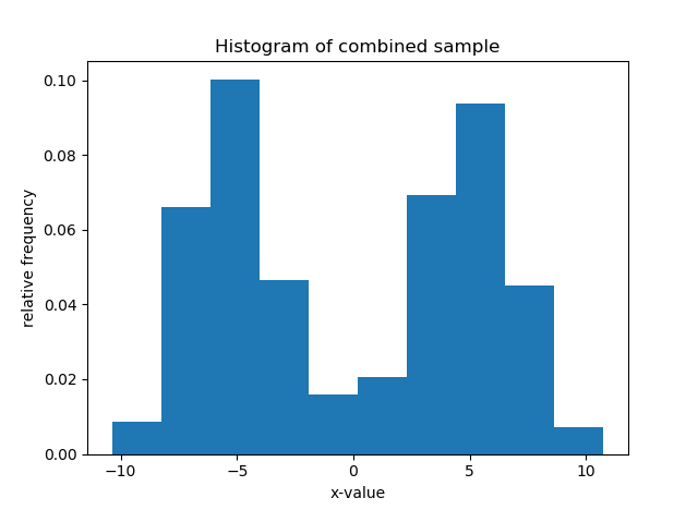
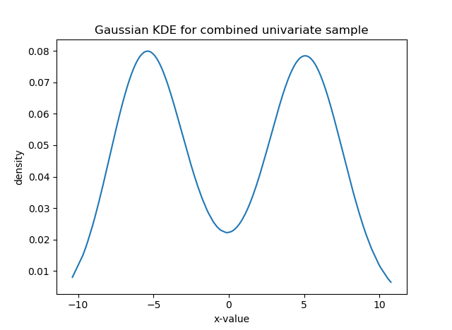
Now we will calculate, within this combined dataset, which values are anomalies. That is, assuming these are a single distribution, which ones are unusual relative to the others. This is done by setting the parameter \texttt{s1\_ind} to be all indices, and \texttt{s2\_ind=None}. Looking at the density plot above, values at either extreme of the plot (around -10 or 10), where the density is low, should be outliers. Because the two samples are nearly separable, some points in the center of the combined sample, where there is a valley, may be considered outliers. This is indeed what we see in the left plot below, these points have higher LDF values (y-axis), with a smaller peak in the middle around x=0. In this case, the LDF scores vary within a possible range of [0,10] , since the constant c=0.1.
The right plot below shows the LDE for each member of the sample. Since the LDE represents the density, the plot shape should look similar to the kernel density estimate of the distribution above, which it does; however the kernel density values and the LDEs themselves do not have to be similar, only the shape. Recall that the LDE and LDF can be sensitive to the m and k neighborhood size inputs.
#distance matrix
x_comb_array = np.reshape(x_comb, newshape=(600,1))
univariate_dist = squareform(pdist(X = x_comb_array, metric = 'euclidean'))

#initialize base distribution as all values
univariate_base = LDF_base(dmat=univariate_dist, s1_ind = s1_ind + s2_ind, mneibs=20,
                                                   neibs=10,
                                                   obs_values=x_comb_array.reshape(1,600)[0].tolist())
#s2_ind = None means calculate internal anomalousness
univariate_base.calculate_LDFs(s2_ind = None, dim=1)

#plot of LDE
plt.scatter(x_comb, univariate_base.LDF_scores["density"])
plt.title("{x1} U {x2} density estimate from LDE")
plt.ylabel("LDE")
plt.xlabel("x-value")

#plot of LDF score
plt.scatter(x_comb, univariate_base.LDF_scores["LDF"])
plt.title("{x1} U {x2} internal LDF scores")
plt.ylabel("LDF outlier score")
plt.xlabel("x-value")
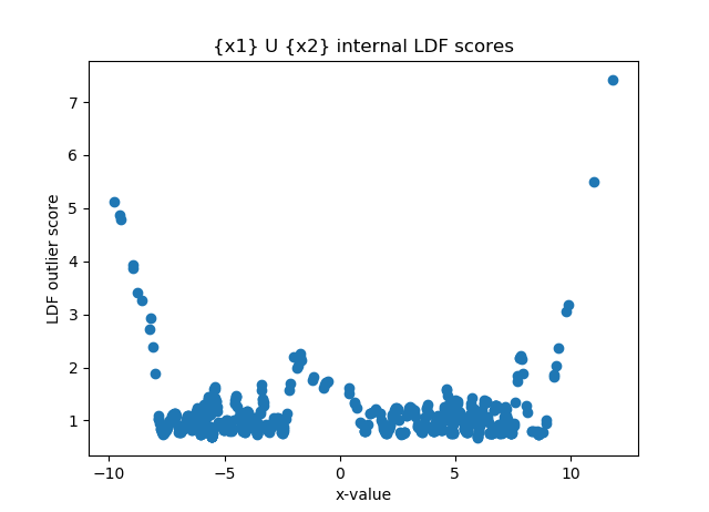

Furthermore, we can see that since the entire set \texttt{x1} and \texttt{x2} were used as the base, and we used the same Gaussian distribution for both, the LDFs for either are very similarly distributed.
# show that LDFs are similarly distributed for two groups
univariate_base.LDF_scores.loc[:,"group_id"] = 1
univariate_base.LDF_scores.loc[s2_ind, "group_id"] = 2

univariate_base.LDF_scores.groupby("group_id")["LDF"].plot.kde(xlim=[0, 10], legend=True,
                                                title="LDFs of univariate using {x1} U {x2} as reference (m=10, k=5)")
plt.xlabel("LDF")
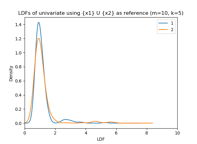
Now, let us use LDFs to compare the two distributions rather than identify outliers within the combined sample. We will calculate an LDF score for each point in \texttt{x2} according to how anomalous it is relative to the sample \texttt{x1} only; that is, we consider them as two different samples rather than as the pooled sample \texttt{x\_comb\_list}. This is done for each point in \texttt{x2} by identifying its m-nearest neighbors (and the k^{\textrm{th}} nearest point of each of these neighbors) only within the reference sample \texttt{x1}. We do not care how anomalous points in \texttt{x2} are relative to their sample, but only to the points in \texttt{x1}. Note that we here look for the m=10 nearest neighbors as opposed to m=20 as before.
#initialize base distribution on s1 ONLY
univariate_base_s1 = LDF_base(dmat=univariate_dist, s1_ind = s1_ind,
                                  obs_values=x_comb_array.reshape(1, 600)[0].tolist())
#notice here, this sample overlaps with s1_ind, just showing it is possible
univariate_base_s1.calculate_LDFs(s2_ind = list(range(250,360)), dim=1)
#overwrite, use different ones.
univariate_base_s1.calculate_LDFs(s2_ind = s2_ind, dim=1)

plt.scatter(univariate_base_s1.LDF_scores.loc[s2_ind, "value"],
                univariate_base_s1.LDF_scores.loc[s2_ind, "LDF"])
plt.title("LDF for {x2} with {x1} as reference, by value")
plt.xlabel("x-value")
plt.ylabel("LDF")
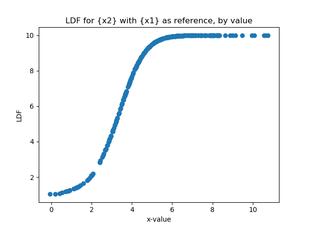
The plot above shows the LDFs for elements of \texttt{x2} when ordered by value.
Due to the overlap in the samples, the lower-valued elements in \texttt{x2} will not be so anomalous (since \texttt{x1} has high density there), but the LDF score, and thus the degree of anomalousness, increases as the element value increases, and thus gets farther away from the observed range of \texttt{x1}. This is a relatively simple example, but if the two sample densities overlap in more complicated way, we will see the LDF scores change accordingly. This method can be used to determine how unlikely points in \texttt{x1} are to have come from \texttt{x2}, by determining a maximum acceptable LDF threshold (e.g., 5).
Similarly, below, we plot the density of each group’s LDF score (recall, \texttt{x1}) elements are being compared internally. We see that for \texttt{x1} (in blue) have very low LDF scores (not anomalous), while \texttt{x2} elements have much higher scores.
univariate_base_s1.LDF_scores.groupby("group")["LDF"].plot.kde(xlim=[0,10], legend=True,
                                                             title="LDFs of univariate using {x1} as reference (m=10, k=5)")
plt.xlabel("LDF")
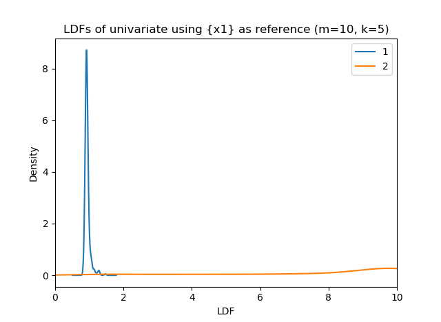
Example on text data
Now, we will conduct a second experiment to demonstrate that this outlier technique can be applied in many circumstances. In the following, we have a fixed vocabulary of 15 words ("Apple", "Ball", "Car", "Dog", "Eggs", "Family", "Gift", "House", "Iron", "Joke", "Kite", "Lime", "Monkey", "Nail", "Orbit" ). We create two sets of ‘documents’, \texttt{s1} and \texttt{s2}. \texttt{s1} documents consist of ‘sentences’ of 4 words selected with replacement from the first five words; \texttt{s2} documents consist of ‘sentences’ of 5 words selected from the last five words. There is potential overlap of the words “House” and ”Iron” between the two samples. Because of this overlap, we form \texttt{s2} by making sure the last word is not “House” or “Iron”; otherwise, some documents in the two samples will contain an identical set of words, and thus the distance between them will be 0. This will cause the local density estimate (LDE) to be very large, which skews the results. This is also why we impose a minimum distance correction to keep the results from ‘blowing up’.
#now generate NON-NUMERIC data, analyzed only through the resulting distance matrix
from sklearn.feature_extraction.text import CountVectorizer
import matplotlib.pyplot as plt

# note the words "House", "Iron" are shared
group_A_words = ["Apple","Ball",    "Car",  "Dog", "Eggs", "Family", "Gift", "House", "Iron"]
group_B_words = ["House", "Iron",  "Joke", "Kite",  "Lime", "Monkey", "Nail", "Orbit"]

s1 = np.random.choice(a=group_A_words, size=(len(s1_ind), 4)).tolist()
s2 = np.random.choice(a=group_B_words, size=(len(s2_ind), 4)).tolist()
#make sure s2 cannot be basically the same as any s1 documents by
#sampling from the non-overlapping words
s2 = [words + [np.random.choice(a=[ "Joke", "Kite",  "Lime", "Monkey", "Nail", "Orbit"], size=(1, 1))[0,0]] for words in s2]

#s1 and s2 are lists of 'documents' consisting of 4 or 5 words
#sort them for readability, and sort words within each sentence
s1 = sorted([sorted(a) for a in s1])
s2 = sorted([sorted(a) for a in s2])

#now paste into sentences for use with Vectorizer
s1 = [" ".join(a) for a in s1]
s2 = [" ".join(a) for a in s2]

# show a few examples
print(np.random.choice(a=s1, size=5, replace=False))
#['Apple Car Car House' 'Car Dog Dog Iron' 'Ball Dog Dog Gift'
# 'Car Car Dog Gift' 'Apple Ball Family Iron']

print(np.random.choice(a=s2, size=5, replace=False))
#['House Iron Kite Kite Orbit' 'Iron Joke Lime Orbit Orbit'
# 'Iron Nail Nail Nail Orbit' 'Joke Joke Lime Orbit Orbit'
# 'House Iron Lime Lime Monkey']
Here, we will only identify outliers within \texttt{s2} compared to \texttt{s1}. We will embed the combined sample using term frequencies (see blog article “What are good ways to represent text documents”), where each document is represented as a 15-element vector (one for each potential word in the corpus) containing the frequency of each word in the sentence. The dimension of the data is 15 (unlike the previous sample, which had univariate dimension), which is an input into the LDF algorithm. Note that the document lengths differ between the two samples, which illustrates that this is not a limitation for this technique, as opposed to numeric vector-valued data, which generally have to be of the same dimension to have pairwise distances calculated between them.
#Count frequency of words
term_freq = CountVectorizer().fit_transform(s1 + s2)
term_freq = term_freq.toarray()
print(term_freq[0:6,:])

#the first sentence has ‘Apple’ 3 times and ‘Car’ once
#[[3 0 1 0 0 0 0 0 0 0 0 0 0 0 0]
# [3 0 0 0 0 0 0 0 1 0 0 0 0 0 0]
# [2 1 1 0 0 0 0 0 0 0 0 0 0 0 0]
# [2 1 1 0 0 0 0 0 0 0 0 0 0 0 0]
# [2 1 0 1 0 0 0 0 0 0 0 0 0 0 0]
# [2 1 0 0 1 0 0 0 0 0 0 0 0 0 0]]

#note it has 15 columns (dimension)
#calculate embedding dimension (number of unique words) for knn adjustment
term_freq_dim = term_freq.shape[1]

#note that the overlapping words (in the middle) occur more in more observations because
#they can be present in both
np.apply_along_axis(arr=term_freq, axis=0, func1d= lambda x: np.mean(x>0))

#array([0.18833333, 0.215     , 0.20166667, 0.2       , 0.155     ,
#       0.17666667, 0.205     , 0.375     , 0.38166667, 0.25666667,
#       0.245     , 0.26      , 0.255     , 0.27166667, 0.25833333])
We then use cosine distance (see blog article “What are good ways to represent text documents”) to calculate pairwise distance between document embeddings. Cosine distance ranges from [0,1], with 0 (blue) indicating similarity. We see in the resulting cosine matrix distinct bluish squares, which show that within each group, the internal similarity is high. However, due to the overlap of words, we occasionally see specks of blue (between-group-similarity) in the reddish high-distance squares.
#now calculate Cosine distance matrix
#Group 1 are a lot more similar to each other than to group 2, but there will be some overlap
#there are patterns in the matrix below; these are an artefact because we sorted the
#documents alphabetically within each sample.  If they were unsorted, the blue/red rectangles
#would be of more uniform color

cosine_dist = squareform(pdist(X =BOW, metric = 'cosine'))
plt.matshow(cosine_dist, vmin = 0, vmax = 1, cmap = "bwr")
plt.colorbar()
plt.title("Cosine distance plot")
plt.show()
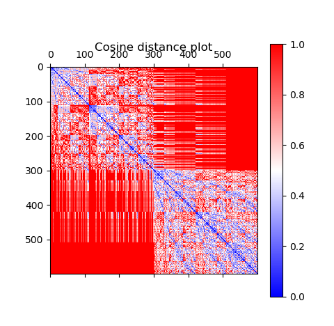
Now, calculate the LDF scores of group 2 documents relative to group 1, using cosine distance. A quick note on the input parameters k and m: m determines the number of nearest neighbors of each observation x used to determine its density, and k acts as a smoothing parameter which represents the distance from each of these m neighbors to its k^{\textrm{th}} neighbor. Setting k low means the density depends mostly on the distance from x to each of its neighbors, without regard to their distances to other members. A low k will over-emphasize the low internal distance between observations in \texttt{s1}---that is, between observations from \texttt{s1} in the same mNN as a \texttt{s2} document and their k^{\textrm{th}} neighbors, which will tend to be more similar since they are generated from the same word set---as opposed to the distance between \texttt{s2} documents and their mNNs in \texttt{s1}---which will tend to be larger due to the smaller overlap)
Allegorically, this means person x can be considered a friend (non-outlier) of a large group of people if he is good friends with a certain (m-size) subset, without regard to whether these m people are friendly (have low k-neighbor distance) to the others in the group. Setting k higher smooths this out and requires a more global outlook. In reality, one needs to experiment with different values for the parameters.
# now set only s1 as the base
term_sample = LDF_base(dmat=cosine_dist_mat, s1_ind = s1_ind, mneibs=10, kneibs=5,
                                              obs_values = s1 + s2,  min_distance=1E-3)
term_sample.calculate_LDFs(s2_ind = s2_ind, dim = term_freq_dim, show_neib_values = True)

term_sample.LDF_scores.groupby("group")["LDF"].plot.kde(xlim=[0,10], legend=True,
                                                     title="LDFs of sentences using s1 as reference (m=10, k=5)")
plt.xlabel("LDF")
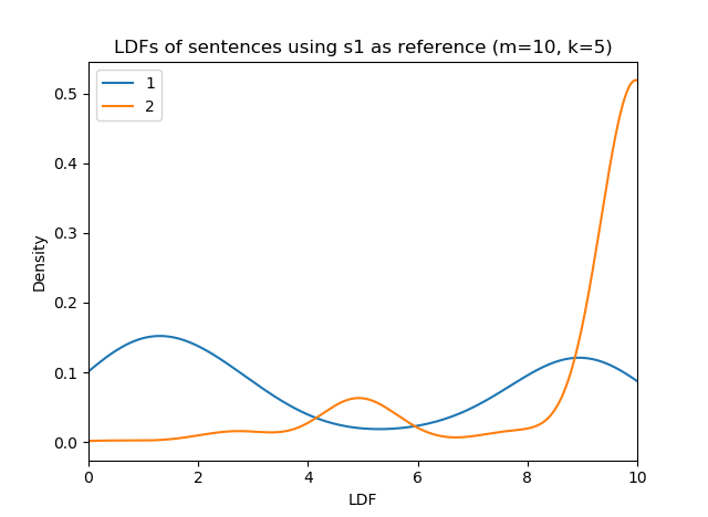
Above, again we see that since \texttt{s1} is the baseline, the sentences in \texttt{s1} have lower LDF, even though some of them are very anomalous (LDF near 10). However, nearly all of the \texttt{s2} (orange) have very high LDFs.
We now sort by LDF to see what types of documents are the least and most anomalous, relative to \texttt{s1}:
# sort by LDF
display_columns = ["density", "LDF", "value"]
term_sample.LDF_scores = term_sample.LDF_scores.sort_values(by="LDF", ascending=True)

#Least anomalous print(term_sample.LDF_scores[display_columns].loc[term_sample.LDF_scores["group"]==2].head().to_string(index=False))

#       density       LDF                        value
# 6.145531e+07  0.351844  House House House Joke Kite
# 1.279022e+05  2.196337    Iron Iron Iron Joke Orbit
# 1.279022e+05  2.196337   Iron Iron Iron Monkey Nail
# 9.343153e+04  2.818703  House Iron Iron Lime Monkey
# 9.343153e+04  2.818703    House Iron Iron Joke Nail

#Most anomalous
print(term_sample.LDF_scores[display_columns + ["neib1"]].loc[term_sample.LDF_scores["group"]==2].tail().to_string(index=True))

  density   LDF                          value                                            neib1
 0.000006  10.0     Joke Kite Lime Monkey Nail  Apple Apple Apple Car (d_xy=1.0000, d_k=0.0963)
 0.000006  10.0    Joke Lime Orbit Orbit Orbit  Apple Apple Apple Car (d_xy=1.0000, d_k=0.0963)
 0.000006  10.0   Kite Kite Monkey Monkey Nail  Apple Apple Apple Car (d_xy=1.0000, d_k=0.0963)
 0.000006  10.0     Kite Nail Nail Orbit Orbit  Apple Apple Apple Car (d_xy=1.0000, d_k=0.0963)
 0.000006  10.0  Monkey Monkey Nail Nail Orbit  Apple Apple Apple Car (d_xy=1.0000, d_k=0.0963)
The most anomalous documents (LDF=10) of \texttt{s2} have no overlapping words with \texttt{s1}. Notice the closest neighbor of all of these documents is “Apple Apple Apple Car”. This is because when determining neighbors, we determine similarity first by the distance between the two, and then by minimizing the potential neighbor’s own distance to its k^{\textrm{th}} neighbor, for breaking ties. In this case, for these anomalous documents, they have the maximum distance (1) from each of the elements in \texttt{s1} (thus all are equally far), but the “Apple Apple Apple Car” has the lowest k^{\textrm{th}} neighbor distance, so it is all of their nearest neighbor.
The least anomalous observations have three out of five words overlapping (“House” or “Iron”) with \texttt{s1}. However, notice that among them, the least anomalous have all three being the same word (e.g. “House House House” as opposed to “House House Iron”). With a large enough sample, a sentence like “House House House Joke Kite” will have neighbors in \texttt{s1} that also have three of four words being “House”. If such neighbors exist, by the nature of cosine distance, documents that have higher counts of the same term will have lower distance (more similarity) than if the counts were more mixed.
For instance, below we have term frequency embeddings of two documents, where there are a total of four words (number of rows), each document has a total of five words (sum down columns), the first two words are shared between them (both first elements in each are nonzero), and they each have one word that is not shared with the other. The first pair (“higher”) have one of the terms having three occurrences, and the other has only one. The second pair (“mixed”) have both shared terms having two occurrences. However, the first pair have slightly lower distance (0.091) than the second pair (0.11). This is why the least anomalous sentences had three of the same word, as opposed to two of one and one of the other (also a total of three), because their distance to their neighbors is lower.
higher = np.array([[3,1,0,1], [3,1,1,0]])
pdist(X=higher, metric="cosine")
#array([0.09090909])
mixed = np.array([[2,2,0,1], [2,2,1,0]])
pdist(X=mixed, metric="cosine")
#array([0.11111111])
Summary
Notice the novelty of this approach. We began with data that was text-based and non-numeric, and we used a distance metric to define pairwise distances. In this case, cosine distance is a well-established metric, but in a custom situation we can define our own metric. Once we have this notion of distance, we use m-nearest neighbors to define a nonparametric density estimate, which is otherwise difficult to define on multivariate or non-numeric data. On the basis of this, we can score observations based on how anomalous they are relative to some other sample.
Question 09: Given two data samples, I would like to conduct a test to identify regions of the domain where the two sample distributions differ significantly. How can I do this?
Answer:
Let’s assume that the data under consideration is univariate, though the technique we will suggest can be extended to several higher dimensions (this requires a more complicated formulation). This question also makes the most sense if the two samples, denoted \mathbf{X}=\{x_1,\dots,x_n\} and \mathbf{Y}=\{y_1,\dots,y_m\}, represent samples of the same underlying random variable (e.g., samples collected on different days), or of different random variables on the same meaningful domain (e.g., one sample of numeric test grades of female students, and one for male students, where the shared numeric range is 0—100). Let f_1 and f_2 denote the true density functions of these variables X and Y, so X \sim f_1 and Y \sim f_2.
There are statistical tests that can detect global differences between two samples, and decide if there has or has not been a change between them. These are called two-sample goodness-of-fit (GOF) tests, in that they test how close f_1 and f_2 are to each other over the entire domain (i.e., a single test). We discussed this issue in a previous article “Question: I have two samples, each representing a random draw from a distribution, and I want to calculate some measure of the distance between them. What are some appropriate metrics?” In Python, unfortunately, there do not appear to be enough standard implementations of these nonparametric tests.
Here, instead of performing a global GOF test, we want rather to specify areas of the domain where the two densities f_1 and f_2 differ significantly (f_1 \ne f_2), where significance is determined by a statistical test. As special cases, we may be specifically interested in areas where one distribution is more dense than the other (f_1 > f_2 or f_1 < f_2). For example, given samples of test grades from male (X) and female (Y) students, such a test may tell us that the distributions are similar except that a significantly higher proportion of females achieved grades in the range [90-95] than did males. This would mean that f_2 > f_1 by a significant amount in the region [90-95].
The test we are illustrating is the univariate local kernel density difference test, described in the paper “Local Significant Differences from Non-Parametric Two-Sample Tests”. These tests are implemented in the R package ks . I have implemented the relevant function in Python as described below.
The full Python code is available here.
Kernel density estimation
For the purposes of the test, we must first conduct a kernel density estimate (KDE) of the two samples and obtain estimates of the densities at a common set of K equally-spaced points \delta_1,\dots,\delta_K; these points typically span either the range of values observed, or the known theoretical range of values (e.g., [0,1] for the Beta density we use). The result will be the KDEs \hat{f}_1 and \hat{f}_2, which approximate the theoretical densities f_1 and f_2. We obtain the estimated density values \hat{f}_1(\delta_i) and \hat{f}_2(\delta_i) at each of these points \delta_i. When conducting a KDE, an estimator will determine the optimal bandwidth h for fitting a density to the data, given the chosen kernel function (e.g., Gaussian, uniform, Epanechikov, etc.). The bandwidth tells the kernel function how large of a neighborhood to use around each point x when it uses x’s neighboring points to estimate the density at f(x). This parameter (h_1 and h_2 for each density, which can differ) is a required input for the test. There are several common algorithms (e.g., Scott, Silverman, Improved Sheather-Jones [ISJ]) that can be used to estimate the optimal bandwidth from a given sample.
import numpy as np
import pandas as pd
from scipy.stats import chi2
from statsmodels.stats.multitest import multipletests
import matplotlib.pyplot as plt
from statsmodels.nonparametric.kde import KDEUnivariate
from copy import deepcopy

def paired_kde_estimate(sample1, sample2, xrange,
	num_x_points=10000, kernel_name="gau",
	bw_method="normal_reference"):
   # estimate density on common set of points

   # in case desired range is different (or wider) than the observed one
   xmin= min([xrange[0], np.min(sample1), np.min(sample2)])
   xmax= max([xrange[1], np.max(sample1), np.max(sample2)])
   sample1 = sample1[np.logical_and(sample1 >= xmin, sample1 <= xmax)]
   sample2 = sample2[np.logical_and(sample2 >= xmin, sample2 <= xmax)]

   # equally-spaced discretization of the space
   xvalues = np.linspace(start=xmin, stop=xmax, num=num_x_points, endpoint=True)

   # fit to the two samples; important so can have different bandwidths
   kde1 = KDEUnivariate(endog=sample1)
   kde2 = KDEUnivariate(endog=sample2)
   # evaluate both at the equally spaced xvalues
   kde1.fit(kernel=kernel_name, bw=bw_method, fft= kernel_name == "gau")
   kde2.fit(kernel=kernel_name, bw=bw_method, fft= kernel_name == "gau")

   f1 = kde1.evaluate(point=xvalues)
   f2 = kde2.evaluate(point=xvalues)

   density_summary = {"f1": f1, "f2": f2, "bandwidth1": kde1.bw, "bandwidth2": kde2.bw,
                  "x": xvalues, "n1": len(sample1), "n2": len(sample2)}

   return density_summary
First, we generate two random samples (they can be of different size; here they are n_1=8,000 and n_2=6,000). These samples are mixtures of two random Beta distributions, which create bi-modal distributions with domain on [0,1]. We then use the \texttt{paired\_kde\_estimate} function above to estimate their densities using a Gaussian kernel (though we could have picked a different one) on a shared set of K=10,000 equally-spaced points \{\delta_i\} between 0 and 1.
sample_X = np.append(np.random.beta(a=30, b=10, size=4000), np.random.beta(a=10, b=30, size=4000))
sample_Y = np.append(np.random.beta(a=27, b=12, size=3000), np.random.beta(a=10, b=25, size=3000))

paired_kde = paired_kde_estimate(sample1=sample_X, sample2=sample_Y, xrange=[0, 1], num_x_points=10000)
The function \texttt{paired\_kde\_estimate} returns a dictionary of items:
- “f1” and “f2”: vectors of the estimated density values of the two samples’ distributions at the set of values “x” (that is, the values \{\delta_i\} are also returned).
- “bandwidth1” and “bandwidth2”: float values of the optimal bandwidths for each sample (will be different).
- “n1” and “n2”: the sizes of each of the samples.
Local density test
Using the output of the paired density estimation (as mentioned previously, this had to be done at a common set of points), we now conduct a local difference test between the two density estimates. This function takes the previous function’s output as input.
def kde_local_test_online_1d(density_summary, alpha=0.05):
   dim = 1
   RK = (4 * np.pi) ** (-0.5 * dim)

   fhat1_est = density_summary["f1"]
   fhat2_est = density_summary["f2"]
   eval_points = density_summary["x"]
   h1 = density_summary["bandwidth1"]
   h2 = density_summary["bandwidth2"]
   n1 = density_summary["n1"]
   n2 = density_summary["n2"]

   # density difference and its variance
   h2D2fhat = 0
   fhat_diff = fhat1_est - fhat2_est - 1/2 * h2D2fhat

   # variance of difference uses bandwidths as a component
   var_fhat_diff = (fhat1_est/(n1 * h1) + fhat2_est/(n2 * h2)) * RK

   # now test for significance
   gridsize = len(eval_points)

   X2 = np.empty(gridsize)
   X2.fill(np.nan)

   is_not_missing = var_fhat_diff > 0
   is_missing = np.logical_not(is_not_missing)

   X2[is_not_missing] = (fhat_diff[is_not_missing] ** 2) / var_fhat_diff[is_not_missing]

   # p-value is the upper tail probability of a chi^2 variable with 1 dof
   pvalue = np.empty(gridsize)
   pvalue[is_not_missing] = 1 - chi2.cdf(x=X2[is_not_missing], df=1)

   # there may be instances of some of the p-values being NaN
   # perform multiple testing adjustment on the ones that are not NaN

   fhat_diff_signif = np.empty(gridsize).astype('bool')
   fhat_diff_pval = np.empty(gridsize)

   is_zero = deepcopy(is_not_missing)
   is_zero[is_not_missing] = pvalue[is_not_missing] == 0
   fhat_diff_signif[is_zero] = True
   fhat_diff_pval[is_zero] = 0
   pvalue_test_subset = deepcopy(is_not_missing)
   pvalue_test_subset[is_not_missing] = pvalue[is_not_missing] > 0

   if np.any(pvalue_test_subset):
      # use the multiple hypothesis adjustment to control overall familywise rate
      decision_vec, adj_pval_vec = multipletests(pvals=pvalue[pvalue_test_subset], is_sorted=False,
                                       method='simes-hochberg', alpha=alpha)[0:2]

      fhat_diff_signif[pvalue_test_subset] = decision_vec
      fhat_diff_pval[pvalue_test_subset] = adj_pval_vec

   point_decisions = pd.DataFrame({"x": eval_points, "f1": fhat1_est,
                           "f2": fhat2_est, "diff_is_signif": fhat_diff_signif,
                           "f1_minus_f2": fhat_diff, "pvalue": fhat_diff_pval})

   point_decisions.loc[is_not_missing, "x1_signif_higher_density"] = np.logical_and(fhat_diff_signif[is_not_missing], fhat_diff[is_not_missing] > 0)
   point_decisions.loc[is_not_missing, "x2_signif_higher_density"] = np.logical_and(fhat_diff_signif[is_not_missing], fhat_diff[is_not_missing] < 0)

   if np.any(is_missing):
      # make sure converts to boolean
      for vv in ["x1_signif_higher_density", "x2_signif_higher_density"]:
         point_decisions.loc[is_missing, vv] = np.nan
         point_decisions[vv] = point_decisions[vv].astype('bool')

   return point_decisions
We now conduct the test, storing the result in the output dataframe:
alpha = 0.05

local_test = kde_local_test_online_1d(density_summary=paired_kde, alpha=alpha)
The dataframe returned by \texttt{kde\_local\_test\_online} contains the following columns:
- “x”, “f1”, “f2”: the x-values and corresponding density estimates.
- “f1_minus_f2”: the evaluated difference between the densities. This, along with the estimated variance, determines whether the difference is significantly large (in absolute value).
- “pvalue”: the p-value of the test. Low values indicate a more significant difference.
- “diff_is_signif”: True if pvalue \leq alpha (input), and False otherwise; this indicates if the test detected a significant difference.
- Two one-sided significance indicators: “x1_signif_higher_density” is True if the “diff_is_signif” is True and “f1_minus_f2” > 0 (i.e., f_1 > f_2); this means that not only is the difference significant, but that the first density is more concentrated here. “x2_signif_higher_density” is analogous except it indicates where f_2 > f_1. At each x-value where “diff_is_signif” is True, exactly one of these indicators will be True; otherwise they are both False.
Now, we want to identify sets of intervals where the difference between f_1(x) and f_2(x) is significant. Let p_i be the p-value for the test of whether f_1(\delta_i) = f_2(\delta_i). A significant interval is an interval \[\delta_i, \delta_j\] for which all of p_i,\dots,p_j are \leq \alpha (that is, they are significant). Thus, we simply join all consecutive \delta_i with significant p-values. This can be done in the following function:
def points_to_intervals(df, bool_vec, enforce_integer=False):
   x = df["x"]
   if enforce_integer:
      xlist = x.tolist()
      upper = deepcopy(xlist)
      lower = deepcopy(xlist)
   else:
      midpoints = x[:-1] + 0.5 * np.diff(x)
      midpoints = midpoints.tolist()
      # lower and upper ends of intervals
      lower = [-1 * np.infty] + midpoints
      upper = midpoints + [np.infty]

   signif_is_missing = np.isnan(bool_vec)
   signif_is_not_missing = np.logical_not(signif_is_missing)

   if np.all(signif_is_not_missing):
      is_signif = np.where(np.logical_and(bool_vec == True, signif_is_not_missing))[0]
   else:
      # to avoid splitting the intervals unnecessarily if test is missing
      # makes missing values count as True
      is_signif = signif_is_missing
      is_signif[signif_is_not_missing] = bool_vec[signif_is_not_missing]
      is_signif = np.where(is_signif)[0]

   start_indices = [ii for ii in is_signif if (ii == 0) or (ii-1) not in is_signif]
   end_indices = [ii for ii in is_signif if (ii == len(bool_vec)) or (ii+1) not in is_signif]

   # return fraction of density in each interval
   dx = df["x"].iloc[1] - df["x"].iloc[0]
   f1_area_intervals = np.array([dx * df["f1"].iloc[ii:(jj+1)].sum() for ii, jj in zip(start_indices, end_indices)])
   f2_area_intervals = np.array([dx * df["f2"].iloc[ii:(jj+1)].sum() for ii, jj in zip(start_indices, end_indices)])
   f1_total_area = dx * df["f1"].sum()
   f2_total_area = dx * df["f2"].sum()

   lower_bounds = [lower[ii] for ii in start_indices]
   upper_bounds = [upper[ii] for ii in end_indices]

   significant_intervals = pd.DataFrame({"lower": lower_bounds, "upper": upper_bounds,
                                "f1_area": f1_area_intervals / f1_total_area,
                                "f2_area": f2_area_intervals / f2_total_area})

   return significant_intervals
Which we run on the output of the local interval test. The function requires an input \texttt{bool\_vec} True/False vector where True indicates the test was significant at that point.
significant_intervals = points_to_intervals(df=local_test, bool_vec=local_test["diff_is_signif"])
# one-sided test
significant_intervals_f1_higher = points_to_intervals(df=local_test, bool_vec=local_test["x1_signif_higher_density"])
significant_intervals_f2_higher = points_to_intervals(df=local_test, bool_vec=local_test["x2_signif_higher_density"])
And now plot the results:
plt.subplot(2, 1, 1)
plt.plot(local_test["x"], local_test["f1"], color="red", label="f(X)")
plt.plot(local_test["x"], local_test["f2"], color="blue", linestyle="--", label="f(Y)")
plt.title(label="Two mixture-beta samples and density estimates")
plt.xlabel(xlabel="x")
plt.ylabel(ylabel="density")
plt.ylim(bottom=0)
plt.legend(loc="upper right")
for xl, xr in zip(significant_intervals_f1_higher["lower"], significant_intervals_f1_higher["upper"]):
   plt.axvspan(xmin=xl, xmax=xr, alpha=0.1, facecolor="r")
for xl, xr in zip(significant_intervals_f2_higher["lower"], significant_intervals_f2_higher["upper"]):
   plt.axvspan(xmin=xl, xmax=xr, alpha=0.1, facecolor="b")


plt.subplot(2, 1, 2)
plt.plot(local_test["x"], local_test["pvalue"], label="p-value")
plt.title(label="Local density test p-value")
plt.xlabel(xlabel="x")
plt.ylabel(ylabel="p-value")
plt.axhline(y=alpha, color="black", linestyle="--", label="alpha")
plt.legend(loc="upper right")
plt.ylim(bottom=0, top=1)

for xl, xr in zip(significant_intervals["lower"], significant_intervals["upper"]):
   plt.axvspan(xmin=xl, xmax=xr, alpha=0.1, facecolor="g")
plt.subplots_adjust(hspace=0.4)
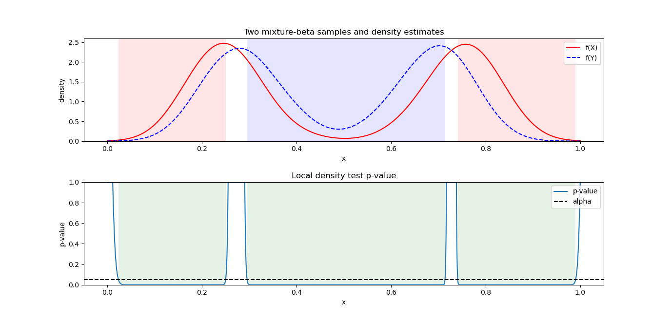
The upper plot shows the estimated kernel density functions, with f_1 (for X) depicted as a solid red line and f_2 (for Y) as a dashed blue line. The lower plot shows the p-values (blue line) of the local test. The decision threshold \alpha, here 0.05, is shown by the horizontal dashed line. Wherever the blue line is below \alpha, the p-value detects a significant difference. These regions of the domain x \in [0,1] are shaded in green. In the top image, these regions are colored according to whether f_1 (red) or f_2 (blue) is higher (as estimated by the KDE). We see that there are gaps between the rectangles where, for instance, f_1(x) \ne f_2(x), that is, the densities are not identical, but the difference is relatively small so it is determined to be insignificant. Also, the densities are essentially identical at the extremes of the domain where they both have very low values. In this example, the densities differ significantly in most places, so the majority of the domain is judged to be significantly different in terms of the densities.
Question 10: I have two (or more) models whose performance I want to compare, either on the same or different datasets. I may have conducted cross-validation on each, and thus have a set of results (e.g., accuracy scores) on each, and there may be overlaps in the ranges of these values. How do I statistically decide which model I should prefer?
Answer:
Setup
Say we have r datasets D_1,\dots, D_r. The target feature can be either categorical (classification) or numeric (regression, etc.). For the purposes of this discussion, a “model", say, \mathcal{M}_1, refers to an algorithm that provides a prediction and has specified hyper-parameter values. For instance, \mathcal{M}_1 may be “Random forest with 20 trees and a minimum split criterion of 3 observations". Changing one or more of the hyperparameters (e.g., the number of trees, split criterion) means it is a different model, as does, of course, using a different ML algorithm.
Say we have two models \mathcal{M}_1 and \mathcal{M}_2. As noted above, these may be two different algorithms, say, random forest or SVM, or the same algorithm with different hyperparameter values. However, assume that for each, the same score function (e.g., R-squared, classification accuracy, balanced accuracy, etc.) can be computed to evaluate their predictions on the target feature. Given the set of datasets \{D_i\}, we want to statistically determine which model has higher performance (e.g., higher accuracy) overall.
Note: In this blog entry, we recommend a technique outlined in the paper “Time for a Change: A Tutorial for Comparing Multiple Classifiers Through Bayesian Analysis", by Benavoli, Corani, Demsar, and Zaffalon (http://www.jmlr.org/papers/volume18/16-305/16-305.pdf). Here, we assume that cross validation (CV) has been conducted, and that the results are not obtained from repeated independent samples from a larger dataset; that is, we assume that the amount of data is limited (hence CV is used). The key aspect of CV, as we discuss, is that it generates a certain kind of statistical dependence in the results that must be accounted for. If this is not the case, randomly drawn samples from the same dataset are likely statistically independent, and can be compared with paired two-sample tests (which assume the samples result from iid draws), such as presented here on Question 04.
Purpose of Cross-validation (CV)
It is not enough to simply obtain, say, the classification accuracies of \mathcal{M}_1 and \mathcal{M}_2, say 0.85 and 0.87, on a particular dataset D_i, or even on each of the datasets, and say that \mathcal{M}_2 is better. This is because of the following two sources of inherent variability in evaluating the model performances. The first means that using only one dataset D_1 to compare the two models is not enough, while the second means that even if we have multiple datasets, evaluating the score function once on each is not enough:
- Choice of datasets: One dataset, say, D_1, may be only one of the possible datasets we may be interested in, and it is not enough to consider results on just one. We will assume, however, that using r datasets D_1,\dots,D_r better represents the variability in datasets, and the more we use, the more reliable the conclusions are.
- Choice of training/test split for a given dataset D_i: Any given dataset D_i, when split into training and test data, represents only one given sample of the theoretical population eligible to be in that dataset. It is this second source of variation that commonly leads to the use of K-fold cross validation (CV) in evaluating a model’s performance on a given dataset.
For the meantime, let’s assume we are dealing with a single dataset D_1, so only the second source of variation is relevant. Typically, D_1 should be split into a train and test set, in order to assess how the model performance generalizes, and so even if the accuracies, say 0.85 and 0.87, are obtained this (correct) way, it only represents one outcome of a single choice of splits. In statistics, a single measurement (e.g., 0.85) does not represent the possible variability in measurements; we need to obtain multiple measurements (i.e., a sample) instead.
A sample of such measured performances is meant to represent the variability in results based on the choice of training data (i.e., the training split). Therefore, often K-fold cross-validation (CV, discussed below), is used. CV balances the fact that a model \mathcal{M} typically improves with the amount of training data, but that in a realistic scenario we have a limited amount of training data and cannot go out and collect, say, K new datasets, each the same size as D_1. Therefore, CV is often used.
In K-fold CV, for a given choice of integer K (often 5 or 10), the dataset D_1 is split randomly into K equal-size partitions (folds), which by definition do not overlap and cover the entire dataset. For instance, if K=10 and the dataset has N=200 observations, each fold consists of 200/10=20 observations; the first fold may consist of the first 20, etc., assuming the order has been randomized. Each observation belongs to exactly one of the folds, and, assuming there is no stratification, is equally likely to belong to each of them. Then, K experiments are conducted where one of the K partitions is separated as a test set, the model is trained on the dataset combining the remaining K-1 folds and some metric (usually prediction accuracy) is measured on the withheld test set. The result of CV is K performance measurements, one on each of the K folds which served as a test set; the test sets used to evaluate the model do not overlap, but the train sets do overlap since a train set consists of K-1 of the folds each time.
(Source: https://en.wikipedia.org/wiki/Cross-validation_(statistics))
-
The CV procedure has two main benefits:
- It reduces model overfitting by making sure that in each of the K experiments, none of the test data is used in training, which would happen if we simply trained the model on all the data and then evaluated it by using its predictions on all the data as well (i.e., no train-test split).
- This process gives us K instances of the evaluation metric, which gives a better sense of the variability of results that we could expect. Furthermore, these results can be considered to come from a distribution (though they are not truly independent since the data is being reused between folds, as we will discuss), and a statistical test can be conducted. A test needs more than one sample value for each model to be able to compare them statistically. This is the more important aspect for our application.
Properties of CV
Say K=10, and we have a dataset of N=200 observations. Running K-fold CV gives K (in this case, 10) measures of the desired performance metric. Note that here we only assume one model \mathcal{M}_1 is being considered; we have not yet discussed two models. The following properties of CV are important to keep in mind:
- The metric measured during CV estimates what we would expect on other training sets of the same size as those used in CV (that is, of size \frac{k-1}{k}N=180).
- The larger the training set that a model uses to learn, the more accurate it should be.
- For a given dataset size N, when K is higher, each fold (which serves as a test set) is smaller, so the training set is larger each time, and so the model trained on each iteration should be more accurate than if K was smaller.
- However, when K is higher, the mutual overlap between training sets increases, which means that the models trained on each iteration depend more on each other, so the resulting accuracies will be more dependent.
The last point illustrates why we shouldn’t just do leave-one-out CV (N-fold, where N is the number of dataset observations), because the dependence between training sets (and thus their results) complicates statistical inference, which typically assumes independence. The only way to have non-overlapping training sets is to have K=2, so that in the first iteration, one of the two folds is used for training and the other is the test, and in the second iteration, the roles are reversed. However, even in this case, because the training sets cannot by definition overlap (they are mutually exclusive), one is the complement of the other, and thus the two trained models are dependent; this is because mutual exclusivity means dependence, and some overlap (i.e., non-mutual exclusivity) is necessary, but not sufficient, for independence. Two folds from two different datasets will be independent, a case we will address later.
For instance, in a deck of cards, “clubs” and “hearts” are mutually exclusive; this means that the event of drawing a club or a heart are dependent, since knowing a card is a club means you know it is not a heart (that is, its probability of being a heart changes from 0.25 to 0). This is the definition of statistical dependence between two events. But, knowing that a card is a club does not change the probability of it being a king; these two events are statistically independent, and this is possible because there is an overlap between the clubs and kings (the king of clubs).
Several papers attempted to determine which K split (2, 5, etc.) gives the best statistical properties. Since ultimately we will recommend a different approach, we omit this discussion. However, the fact that there is dependence is essential to our recommendation.
Comparing models on a single dataset
The following discussion is based on results in the paper “Time for a Change: A Tutorial for Comparing Multiple Classifiers Through Bayesian Analysis", by Benavoli, Corani, Demsar, and Zaffalon. The paper begins with a discussion about why null hypothesis testing (NHST, a common testing paradigm using p-values) is flawed, and so the paper presents an alternative approach. This material is worth understanding, but we will assume it is given; in the following, we will skip the unnecessary technical details.
On a fixed dataset D_i, let \mathbf{x}^{(k)} be the difference in the performance result (e.g., the accuracy of model \mathcal{M}_1 minus the accuracy of \mathcal{M}_2) on the k^{\textrm{th}} fold) out of K total. Let \mathbf{x} = \begin{bmatrix}\mathbf{x}^{(1)} & \dots &\mathbf{x} ^{(K)}\end{bmatrix} be the K-length vector of the results across the K folds of CV.
The following section explains how the dependence between CV folds is accounted for; readers may want to skip to the next section, “Interpreting the output of the method".
Modeling dependence of CV folds
As we have said, the fact that the CV training sets overlap means that the results across folds for each model are not statistically independent. See the inset “Bayesian correlated t-test" (page 10) in the paper above. Even though the entries of \mathbf{x} are not statistically independent, they should come from the same distribution, which we can characterize by its unknown mean \mu. That is, \mu may be, for instance, the average difference in accuracy; its sign indicates which model tends to be better on that dataset across folds (which should have similar results due to the randomness of the split). We model the vector of differences \mathbf{x} as \mathbf{x} = \mu + \mathbf{v}, where \mathbf{v} is a K-length draw from the multivariate normal distribution MVN(\mathbf{0},\: \mathbf{\Sigma}). Here, \mathbf{\Sigma} is a covariance matrix which represents the variability in resulting differences around \mu. Crucially, while the diagonal values are a constant \sigma^2 (since each observed fold difference \mathbf{x}^{(k)} has the same distribution), the off-diagonal values are a constant nonzero value (since these differences are correlated, due to the CV); if they were independent, the off-diagonal values would be all 0.
A T-distribution is used to perform inference on \mu based on the estimated correlation \rho between values of \mathbf{x}. The standard T-test that is used in simple hypothesis tests (where sample values are independent) uses a T-distribution that is centered around 0 and defined only by its degrees of freedom, which in the T-test is related to the number of observations. However, a more general form of the T-distribution has a location (centering) and scale (spread) parameter as well; this is called a location-scale family and the location is called the non-centrality parameter. In the paper, the inset “Bayesian correlated t-test" (page 11) shows that using a Bayesian setup, we can derive a posterior (meaning “estimated based on data") distribution for \mu, the unknown mean difference between the two measurements across the CVs, by using a generalized T-distribution, where the degrees of freedom is K-1 (n in their notation), and the location and scale parameters are \bar{\mathbf{x}} and \hat{\sigma}^2, the sample mean and sample standard deviation of the values in the difference vector \mathbf{x}.
In the expression for the Student t-test (“St"), the scale parameter is \left(\frac{1}{n} + \frac{\rho}{1-\rho}\right)\hat{\sigma}^2. \hat{\sigma}^2 (the typical notation for variance) is the observed variance of the elements of \mathbf{x}. Here, the correlation \rho=1/K (they use K=10-fold; this is the relative size of the test set). n is the total number of comparisons made, equaling the number of (independent) repetitions of CV times the number of folds (in their example, 10 repetitions of 10-fold CV are done, for a total of n=10\times 10=100 comparisons). So, increasing the constant multiplier of \hat{\sigma}^2 increases the variance. If more folds K are done, \rho will decrease, and so will the multiplier \frac{\rho}{1-\rho}. For a fixed K (and thus, \rho), increasing the number of repetitions will increase n, so 1/n decreases. Thus, increasing either the folds or the number of repetitions will decrease the variability of the results.
Interpreting the output of the method
Before turning to some concrete examples, we add that the paper’s authors use the term "rope" (Region of Practical Equivalence) to denote the minimum absolute value of the observed difference that is practically important. This is because, as discussed in the paper introduction, traditional null-hypothesis statistical tests (with p-values) can detect a very small difference (e.g., a difference in accuracy of 0.003) that may be statistically significant (unlikely to occur by chance), but is not practically significant (e.g., we may not care about such a small difference in accuracy). A ROPE of 0.01 means that the observed difference between two models’ accuracies, say, must be larger in absolute value than 0.01 to be considered as representing a difference. In the code comparisons, with input results ‘x ’ (model A) and ‘y ’ (model B), and a given value of ‘rope’ (0.01), the outputted three-element values in the returned tuple are to be interpreted as probabilities (not p-values) that sum to 1. For instance, if an output is (0.45, 0.05, 0.5), the first and third values are the probability that model y’s accuracy minus model x’s accuracy are negative and positive (below the left end of ROPE and above the right end of ROPE), respectively. In the case of accuracy, these are to be interpreted as the probabilities that model x is better, or model y is better, respectively, since higher accuracy is better. The middle value is the probability that the difference is inside the ROPE, that is that it is practically the same as 0, and the models essentially have equivalent performance on the dataset(s) considered. Two functions are used, \texttt{two\_on\_single} and \texttt{two\_on\_multiple} , for comparing results on a single or multiple datasets, respectively. Two functions are needed because the performances on different datasets are considered independent, while on a single dataset (multiple folds), they are dependent.
In the following code example, we use several common datasets, some of which have a numeric target (for which we use a random forest regression tree model), and the others have a categorical target (for which we use a random forest classifier). For the first, the score metric is mean square error (MSE), and for the second it is classification accuracy; this is to illustrate the method across different types of scores. The models chosen are not claimed to be particularly good, they are just for illustration. Note that there is some degree of randomness in the results, for instance, in the random choice of splits, and in the random simulations in the multiple datasets test.
The full code can be found at model_CV_significance_test.py
Code examples
from sklearn import datasets
from sklearn.model_selection import cross_val_score
from sklearn.ensemble import RandomForestClassifier, RandomForestRegressor
import numpy as np
import pandas as pd
import matplotlib.pyplot as plt
# files from Tutorial (Janez Demsar github)
# need to first clone https://github.com/janezd/baycomp
# and add it as a source root called 'baycomp'
from baycomp.single import two_on_single
from baycomp.multiple import two_on_multiple

# read in several datasets, and set a classification or
# regression target for each
feature_columns = {}
classification_data = {}
regression_data = {}
# set seed to get reproducible results
np.random.seed(2021)

# wine dataset
wine = datasets.load_wine()
feature_columns["wine"] = wine.feature_names
classification_data["wine"] = pd.DataFrame(wine.data, columns=wine.feature_names)
classification_data["wine"].loc[:, "target"] = pd.Series(wine.target).astype('category')

# iris dataset
iris = datasets.load_iris()
feature_columns["iris"] = iris.feature_names
classification_data["iris"] = pd.DataFrame(iris.data, columns=iris.feature_names)
classification_data["iris"].loc[:, "target"] = pd.Series(iris.target).astype('category')

# boston
boston = datasets.load_boston()
feature_columns["boston"] = boston.feature_names
regression_data["boston"] = pd.DataFrame(boston.data, columns=boston.feature_names)
regression_data["boston"].loc[:, "target"] = pd.Series(boston.target)

classification_data["boston"] = pd.DataFrame(boston.data, columns=boston.feature_names)
classification_data["boston"].loc[:, "target"] = (regression_data["boston"]["target"] >= 30).astype('int').astype('category')

# diabetes
diabetes = datasets.load_diabetes()
feature_columns["diabetes"] = diabetes.feature_names
regression_data["diabetes"] = pd.DataFrame(diabetes.data, columns=diabetes.feature_names)
regression_data["diabetes"].loc[:, "target"] = pd.Series(diabetes.target)

classification_data["diabetes"] = pd.DataFrame(diabetes.data, columns=diabetes.feature_names)
classification_data["diabetes"].loc[:, "target"] = (regression_data["diabetes"]["target"] >= 100).astype('int').astype('category')

# example regression and classification models, A=M_1, B=M_2
# parameter min_examples_split differs between each,
# but could also use a different
# algorithm, as long as the same score metric can be calculated
classification_models = {"A": RandomForestClassifier(n_estimators = 25, min_samples_split = 0.1),
"B": RandomForestClassifier(n_estimators = 25, min_samples_split = 0.03)}
regression_models = {"A": RandomForestRegressor(n_estimators=25, min_samples_split = 0.1),
"B": RandomForestRegressor(n_estimators = 25, min_samples_split = 0.03)}

# get total of 50 results on each dataset for each model
kfold = 10
nreps = 5

# each matrix row is a different k-fold split
# need to make sure return a one-D array combining all the reps,
# for which len returns nreps * kfold, hence the "[0]" at the end

class_cvscores = {dfname: {kk: np.array([cross_val_score(estimator=vv, X=df[feature_columns[dfname]],y=df["target"], cv=kfold)
for rr in range(nreps)]).reshape(1,-1)[0]
	for kk, vv in classification_models.items()}
		for dfname, df in classification_data.items()}

reg_cvscores = {dfname: {kk: np.array([cross_val_score(estimator=vv, X=df[feature_columns[dfname]],y=df["target"], cv=kfold)
for rr in range(nreps)]).reshape(1,-1)[0]
	for kk, vv in regression_models.items()}
		for dfname, df in regression_data.items()}
Now we will perform tests, first on a single dataset, then on multiple ones.
# decision on a single dataset for each
class_decision_wine = two_on_single(x=class_cvscores["wine"]["A"], y=class_cvscores["wine"]["B"], rope=0.01, runs=nreps, names=('A', 'B'), plot=True)
plt.title("Classification comparison on Wine dataset")
print(class_decision_wine)
# ((0.5466075364664372, 0.43378466766924106, 0.01960779586432171), <Figure size 638x608 with 1 Axes>)
class_cvscores["wine"]["A"].mean() # 0.9833333333333334
class_cvscores["wine"]["B"].mean() # 0.972156862745098
The above tuple are the probabilities, for the value accuracy(B) – accuracy(A); that it is negative (A is better), that it is about 0 (inside the ROPE, which here is a difference of \pm 0.01 ), or that it is positive (B is better). In the plot below, these correspond to the areas left of the left vertical line (left end of ROPE), between the lines (in the ROPE), and right of the right vertical line (right end of the ROPE). We can conclude that A appears better, but that there is a large probability (about 43%) that they have practically the same performance (inside the ROPE).
A similar analysis can be done on the diabetes dataset, which has a numeric target, where model B (of course, this is a different model B than the one in the classification task) is significantly preferred to A.
reg_decision_diabetes = two_on_single(x=reg_cvscores["diabetes"]["A"], y=reg_cvscores["diabetes"]["B"],	rope=0.01, runs=nreps, names=('A', 'B'), plot=True)
plt.title("Regression comparison on Diabetes dataset")
print(reg_decision_diabetes)
# ((0.893649526497486, 0.09851235046527318, 0.007838123037240852), <Figure size 640x480 with 1 Axes>)
We now perform analysis combining the results of all datasets. Here the analysis is similar, but instead of the probabilities being calculated according to a normal distribution, we use a simplex (spatial representation) instead, since the distribution does not have a particular parametric form. An equilateral triangle is drawn, with “p(ROPE)”, “p(A)” (A is better), and “p(B)” (B is better) in the corners. A large number of simulations are performed, and a point is plotted whose placement depends on the results. The resulting tuple (values shown at corners) is the proportion of points falling into each triangle sector. Here, much higher probability (79% instead of 43% for the single dataset) is given to the ROPE, compared to when the test was performed only on the wine dataset, and A is still preferred to B, though the difference is not practically significant.
# combined over the multiple datasets; note some random element
class_decision_overall = two_on_multiple(x=np.array([vv["A"] for vv in class_cvscores.values()]).reshape(1,-1)[0], y=np.array([vv["B"] for vv in class_cvscores.values()]).reshape(1,-1)[0], rope=0.01, runs=nreps, names=('A', 'B'), plot=True)
plt.title("Classification comparison on all datasets")
print(class_decision_overall)
# ((0.2141, 0.78588, 2e-05), <Figure size 640x480 with 1 Axes>)
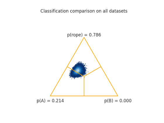
reg_decision_overall = two_on_multiple(x=np.array([vv["A"] for vv in reg_cvscores.values()]).reshape(1, -1)[0],  y=np.array([vv["B"] for vv in reg_cvscores.values()]).reshape(1, -1)[0], rope=0.01, runs=nreps, names=('A', 'B'), plot=True)
plt.title("Regression comparison on all dataset")
print(reg_decision_overall)
# ((0.03222, 0.0, 0.96778), <Figure size 640x480 with 1 Axes>)
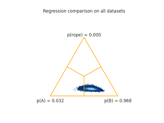
Question 11: I have two datasets, D_1 and D_2, of multivariate samples of the same set of features. I would like to both 1) test whether D_2 appears to have drifted in distribution relative to D_1, and 2) score the features’ contribution to the drift. That is, I want to know which feature(s) in D_2are most anomalous relative to their observed distribution in D_1.
Answer:
Let’s begin with the following assumptions. For an integer p \geq 2, let F_0,\dots,F_{p-1} be a set of numeric features (e.g., F_0 = “AGE”, F_1 = “INCOME”, etc.). Let D_1 and D_2 be two datasets with the same set of features F_0,\dots,F_{p-1}; the datasets can have differing numbers of observations.
In this topic, we focus on outlier detection in a nonparametric setting, which we have addressed in previous entries. Q8 showed a method to score outlying observations in a multivariate nonparametric distribution, given that an appropriate distance metric could be constructed (see the example on non-numeric text data). Q9 showed a method that, given two univariate numeric samples X and Y and kernel-density estimates f_X and f_Y of the two, can identify regions of the domain where the densities differ significantly. This calculation could be done in a two-sided manner, meaning that either f_X(z) or f_Y(z) could be significantly higher than the other for a given point z, or in a one-sided manner, meaning that specifically one was higher than the other.
The key aspect here is that an observation value z is an outlier relative to a baseline distribution f_X if f_X(z) is very low, that is, z is unlikely to be observed in draws from the distribution f_X. This relates to our initial question, because we can consider f_X to be the marginal distribution of one of the numeric features in our datasets, say F_1, and z is a particular value observed for F_1.
For instance, consider the three distributions below. An important criterion is that our solution must be nonparametric, that is, not make assumptions about the distribution. The left image shows an example of a unimodal distribution; when we refer to “unimodal”, we mean this here in the general sense, that is, there may be small peaks (modes) in the tails of the distribution, but that largely the distribution has a single prominent peak; furthermore, the distribution need not be symmetric. A unimodal distribution has a mean that is somewhere in the middle (depending on the symmetry) of its domain; furthermore, the areas of low density are in its tails, which are the furthest regions from the mean. Thus, anomalous observed values (e.g., z=1.75 or 4.75 in this example), which are anomalous because the distribution has low density at those values, also are far from the mean of the distribution. In bimodal or multi-modal distributions, this is typically not the case. For instance, z=3 is an outlier relative to the second plot below, but it is close to the mean of the distribution. As we show below, we cannot use metrics such as the Mahalanobis distance (which operates on multivariate Gaussian-like data, which has a single peak, and thus distance from the mean corresponds to outlier-ness) to determine outliers, since we should not make this assumption about the distribution.
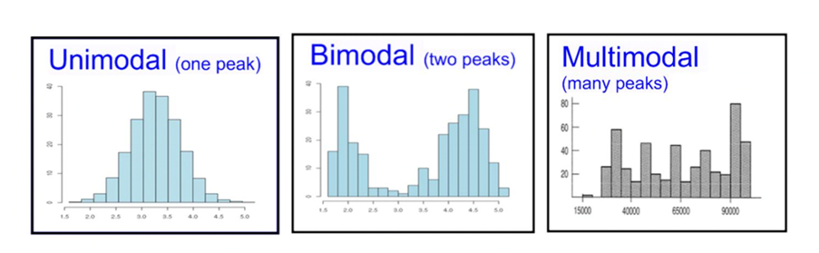
The method we will ultimately use is called Isolation Forest (IF), which is a nonparametric outlier scoring technique developed in a 2008 paper by Liu, Tin, and Zhou.
In Python, it is available in
sklearn.ensemble.IsolationForest See for an example of an introduction to IF.
Here, we highlight the relevant aspects. In short, IF works in a similar manner to Random Forests (RF), which builds a forest (ensemble) of decision trees, each tree on a random subset of the p features, to predict the classification target. In IF, a forest of trees is built in the same way, except there is no target. Rather, in a given tree with a subset of features, the tree randomly selects a feature and splits the observed data for this feature at a random location in its domain. This continues until the tree is able to completely isolate each observed value in its own ‘bin’. Once this is done, the forest determines an outlier score for each observed value based on how many tree splits it took to isolate it. This score is then compared to a threshold to decide if the observation is or is not an outlier. The idea is that observed values that are unusual (low density, particularly if there are large empty gaps separating them from neighboring observations) are more quickly isolated by random splitting than others. And an ensemble of such trees is used to reduce the likelihood of random splitting in a given tree giving a ‘wrong’ answer, that is, it makes the method more robust.
Synthetic data generation
First, we generate some synthetic data, both from a multivariate Gaussian (for which each individual feature is unimodal) and from a Beta distribution, which has the domain [0,1] and can be unimodal in the middle or at the ends, or bimodal, with the modes at each end. The Beta distribution is used to demonstrate that Mahalanobis distance does not work in this case. As a technical note, the IF implementation requires that the data have dtype float, so we explicitly set it to be np.float32 type; also, the input must be an array, not a pandas dataframe.
import numpy as np
import matplotlib.pyplot as plt
import pandas as pd
from sklearn.ensemble import IsolationForest
from collections import Counter
from sklearn.covariance import EllipticEnvelope
from scipy.stats import norm

# multivariate Gaussian
baseline_g = np.random.normal(size=(1000, 4), loc=np.array([0, 0, 0, 0]), scale=np.array([1, 1, 1, 1])).astype(
   np.float32)
# drift and no drift
obs_g_nodrift = np.random.normal(size=(1000, 4), loc=np.array([0, 0, 0, 0]), scale=np.array([1, 1, 1, 1])).astype(
   np.float32)
obs_g_drift = np.random.normal(size=(1000, 4), loc=np.array([1, 0, 0, 0]), scale=np.array([1, 1, 1, 2])).astype(
   np.float32)


# multivariate Beta;
baseline_b =    np.random.beta(size=(1000, 4), a=0.2, b=0.2).astype(np.float32)
obs_b_nodrift = np.random.beta(size=(1000, 4), a=0.2, b=0.2).astype(np.float32)
obs_b_drift =   np.random.beta(size=(1000, 4), a=np.array([2, 0.2, 0.2, 3]), b=np.array([2, 0.2, 0.2, 3])).astype(np.float32)

fig, axs = plt.subplots(2, 2)
pd.DataFrame(baseline_g).plot.kde(ax=axs[0,0])
axs[0,0].set_title("Baseline Gaussian")
axs[0,0].set_xlim(-7, 7)
pd.DataFrame(obs_g_drift).plot.kde(ax=axs[0,1])
axs[0,1].set_title("Drift Gaussian")
axs[0,1].set_xlim(-7, 7)
pd.DataFrame(baseline_b).plot.kde(ax=axs[1,0])
axs[1,0].set_xlim(0, 1)
axs[1,0].set_title("Baseline Beta")
pd.DataFrame(obs_b_drift).plot.kde(ax=axs[1,1])
axs[1,1].set_xlim(0, 1)
axs[1,1].set_title("Drift Beta")

plt.tight_layout()
plt.show()
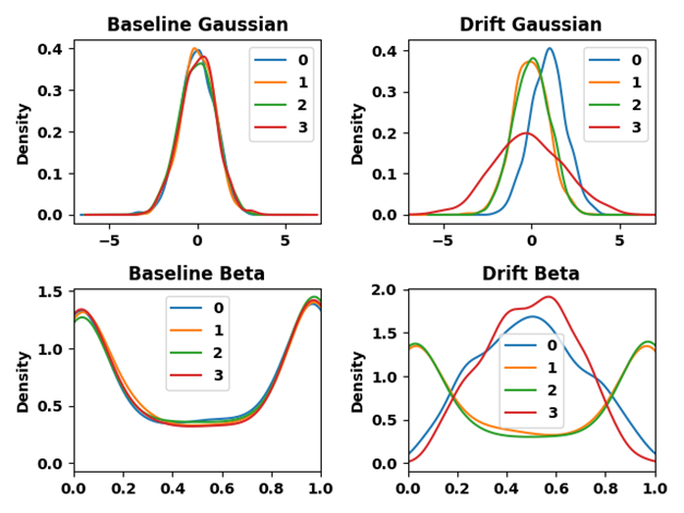
The above plot shows our synthetic data, with p=4 features. Each plot shows the marginal distribution of each feature (by color):
-
Gaussian: Each feature distribution is, by definition, unimodal and symmetric.
- Baseline (upper left): Each feature has identical standard normal distribution, with mean=0 and standard deviation=1.
- Drift (upper right): Features 1 and 2 (orange and green) have the same distribution as under the baseline. Feature 0 (blue) has the same standard deviation but mean 1 instead of 0. Feature 3 (red) has a larger standard deviation (2) but mean 0. Thus, drift here is in values that occur further away from 0 than under the baseline, either because of the shift in mean or increase in standard deviation.
-
Beta: Each feature is distributed between [0,1] and may be unimodal or bimodal.
- Baseline (lower left): Each distribution is identically distributed with parameters (0.2, 0.2), which make the distributions bimodal, with peaks at 0 and 1 and lower density in the middle.
- Drift (lower right): Features 1 and 2 (orange and green) have the same distribution as under the baseline. Features 0 (blue) and 3 (red) are beta-distributed with parameters (2, 2) and (3, 3), respectively. This makes them both symmetric and unimodal with a mean at 0.5 (i.e., where the same two features have low density under the baseline, but which is near the middle or mean of the distribution, rather than in the tails), except feature 3, which has a lower variance..
To repeat, we define outliers as observed values z that occur in low-density areas of a baseline distribution. As we show, the Mahalanobis distance criterion considers points further from the middle of the distribution as outliers; since in a unimodal distribution, the tails coincide with low-density areas. But this is not true for distributions in general, since as we have seen, low-density areas can occur at any point in a distribution. IF scores values as outliers based on how many tree splits it takes to isolate them; these generally coincide with low-density areas, not necessarily in the middle of the distribution (as in areas near 0.5 for the Beta distribution, which is bimodal with peaks, rather than low density, in the extremes).
For both the Gaussian and Beta distributions, a second random sample is generated with the same distribution as the baseline (obs_g_nodrift, obs_b_nodrift). This, and the drifted distribution (obs_g_drift, obs_b_drift), are tested for “outlierness” vs. the baseline. For the sample with the distribution unchanged, we expect to find few outliers.
Outlier scoring
We now show how the two methods determine outlier scores. In both, an input parameter “mod” is either the Mahalanobis or IF model fit to the baseline Gaussian or Beta-distributed data. The observed data (“X”) then has outlier scores predicted for it, on the basis of the baseline model fit. For both models, an assumed outlier proportion (set to 0.05) is set, to determine the threshold for considering an observation to be an outlier. This means that when the observed is the second “no drift” sample (obs_g_nodrift, obs_b_nodrift) compared to the same distribution baseline, about 5% of observations should be scored as outliers. Both functions below return a vector with a corresponding element for each observation in the observed “X”. The value is missing (NaN) if the observation is not an outlier; otherwise, it is the index (0,1,2,3) of the observation that is judged as most anomalous relative to the fit baseline model.
- Mahalanobis: Determines the most anomalous feature f^* by the feature f whose value that is furthest away in terms of standard deviations from the mean value under the baseline (i.e., the furthest by Mahalanobis distance).
- Isolation Forest: Uses a criterion called Local Depth-Based Isolation Forest Feature Importance (DIFFI) from the paper “Interpretable Anomaly Detection with DIFFI” (by Carlettia, Terzib, and Susto, see Algorithm 3 in the paper). This criterion is simple to implement.
- First, the IF is used to predict the outlier score for each observation. The following calculations are done only for each outlier observation x:
- For each tree t in the isolation forest, do the following:
- For each feature f =F_0,\dots,F_{p-1},
- Let C(f, x, t) = number of splits along the tree path ending in the terminal node that x belongs to (recall that fewer splits for a given feature means that value is more unusual relative to that feature’s distribution). C(f)=0 if the feature does not appear in the path.
- Let I(f, x, t) = C(f, x, t)\times(\frac{1}{\textrm{length of path to node of } x}\: - \: \frac{1}{\textrm{tree depth}}). The correction factor -\frac{1}{\textrm{tree depth}} means that if a feature value is the least unusual (it takes the maximum path length in the tree to isolate it), this factor receives a score of 0
- For each outlier observation x, these factors are summed across trees (the trees simply serve the purpose of increasing the robustness of the model):
- C(f, x) = \sum_t C(f,x,t) and I(f, x) = \sum_t I(f,x,t)
- A local feature importance (LFI) score is LFI(f, x) = \frac{I(f, x)}{C(f, x)} . The lower C(f, x) is, the fewer splits (and thus more anomalous) x is by that feature f, so the LFI increases.
- We thus determine the most anomalous feature f^*(x)=\textrm{argmax}_f\: LFI(f, x) , the feature with the highest LFI for that observation. Likewise, the other features can be scored for responsibility by their LFI
- For each feature f =F_0,\dots,F_{p-1},
- For each tree t in the isolation forest, do the following:
- First, the IF is used to predict the outlier score for each observation. The following calculations are done only for each outlier observation x:
# find most anomalous feature

def Mahalanobis_most_anomalous_feature(mod, X, X_fit):
   # EllipticEnvelope scores each row as anomalous (score=-1) or not
    is_anomaly = np.equal(mod.predict(X), -1)
    n_anomalies = is_anomaly.sum()
    most_anomalous_feature = np.empty((X.shape[0],))
    most_anomalous_feature[:] = np.nan

    def responsible_feature(df, base_mean, base_sd):
        # find quantile of each observation wrt features
        quantile_by_feature = np.apply_along_axis(arr=df, axis=1,
                                                  func1d=lambda xx: norm.cdf(x=xx, loc=base_mean, scale=base_sd))
        quantile_by_feature = np.maximum(quantile_by_feature, 1 - quantile_by_feature)
        most_anomalous = np.argmax(a=quantile_by_feature, axis=1)

        return most_anomalous

    if n_anomalies > 0:
        most_anomalous_feature[is_anomaly] = responsible_feature(df=X[is_anomaly, :], base_mean=X_fit.mean(axis=0),
                                                                 base_sd=np.sqrt(np.diag(mod.covariance_)))

    return most_anomalous_feature


def get_parent_nodes(tree):
   # returns dict where key is node of a tree and value is its parent node
    lc = tree.children_left
    rc = tree.children_right
    parent_of = {}
    inner_index = np.where(lc != -1)[0]
    parent_of.update({lc[ii]: ii for ii in inner_index})
    parent_of.update({rc[ii]: ii for ii in inner_index})

    return parent_of


def IF_most_anomalous_feature_DIFFI(mod, X):
    is_anomaly = np.equal(mod.predict(X), -1)
    n_anomalies = is_anomaly.sum()
    most_anomalous_feature = np.empty((X.shape[0],))
    most_anomalous_feature[:] = np.nan

    # maximum depth of tree
    #np.ceil(np.log2(mod.max_samples_))

    if n_anomalies > 0:
        anomaly_rows = np.where(is_anomaly)[0]
        nfeatures = X.shape[1]

        Cloc_f = np.zeros((n_anomalies, nfeatures))
        Iloc_f = np.zeros((n_anomalies, nfeatures))

        for ii, member in enumerate(mod.estimators_):

            tree = member.tree_
            h_max = tree.max_depth

            # build dict mapping child to parent node
            child2parent = get_parent_nodes(tree=tree)
            # # determine leaf node of each observation
            leaves = tree.apply(X)

            for rind, rr in enumerate(anomaly_rows):
                node_path = [child2parent[leaves[rr]]]
                while node_path[-1] != 0:
                    node_path.append(child2parent[node_path[-1]])
                features_used = tree.feature[np.array(node_path)] # these are the indices
                ctr_f = Counter(features_used)
                h_t = len(features_used)
                for feat, cc in ctr_f.items():
                    Cloc_f[rind, feat] = Cloc_f[rind, feat] + cc # add 1 for each occurrence of feature
                    Iloc_f[rind, feat] = Iloc_f[rind, feat] + cc * (1/h_t - 1/h_max)

        # now find the most anomalous (most common anomalous feature) in each row
        # (for each observation)
        LFI = Iloc_f / Cloc_f
        LFI[Cloc_f == 0] = 0.0

        cause = np.apply_along_axis(arr=LFI, axis=1, func1d=np.argmax)
        most_anomalous_feature[is_anomaly] = cause.astype(int)

    # return value is np.nan if observation is not anomaly, otherwise the index
    # of the most anomalous feature
    return most_anomalous_feature
We now fit each model (Mahalanobis and IF) to the baseline datasets, fit them to the observed (drift and no drift) datasets, and store the vector of anomalous feature indicators for each method in. As mentioned, this vector has a missing value if the value is not an outlier.
# anomaly models
IF = IsolationForest(contamination=0.05)
mahalanobis = EllipticEnvelope(contamination=0.05)

def is_anomaly(x):
   return np.logical_not(np.isnan(x))

from collections import defaultdict
anomaly_model = defaultdict(dict)

# Fit IF and Mahalanobis to the Gaussian
mahalanobis.fit(baseline_g)
anomaly_model["Gaussian"]["Mahalanobis"] = {"no drift": Mahalanobis_most_anomalous_feature(mod=mahalanobis, X=obs_g_nodrift, X_fit=baseline_g),
                                 "drift": Mahalanobis_most_anomalous_feature(mod=mahalanobis, X=obs_g_drift, X_fit=baseline_g)}

IF.fit(baseline_g)
anomaly_model["Gaussian"]["IF"] = {"no drift": IF_most_anomalous_feature_DIFFI(mod=IF, X=obs_g_nodrift),
                           "drift": IF_most_anomalous_feature_DIFFI(mod=IF, X=obs_g_drift)}

# now fit both to the Beta
mahalanobis.fit(baseline_b)
anomaly_model["Beta"]["Mahalanobis"] = {"no drift": Mahalanobis_most_anomalous_feature(mod=mahalanobis, X=obs_b_nodrift, X_fit=baseline_b),
                              "drift": Mahalanobis_most_anomalous_feature(mod=mahalanobis, X=obs_b_drift, X_fit=baseline_b)}

IF.fit(baseline_b)
anomaly_model["Beta"]["IF"] = {"no drift": IF_most_anomalous_feature_DIFFI(mod=IF, X=obs_b_nodrift),
                        "drift": IF_most_anomalous_feature_DIFFI(mod=IF, X=obs_b_drift)}

# calculate anomaly_indicator
is_anomaly_vec = {kk: {kkk: {kkkk: is_anomaly(vvvv) for kkkk, vvvv in vvv.items()}
                       for kkk, vvv in vv.items()}
              for kk, vv in anomaly_model.items()}

frac_anomaly = {kk: {kkk: {kkkk: vvvv.mean() for kkkk, vvvv in vvv.items()}
                     for kkk, vvv in vv.items()}
                for kk, vv in is_anomaly_vec.items()}

responsible_feature = {kk: {kkk: {kkkk: Counter(anomaly_model[kk][kkk][kkkk][vvvv]) for kkkk, vvvv in vvv.items()}
                            for kkk, vvv in vv.items()}
                       for kk, vv, in is_anomaly_vec.items()}

# print diagnostics
for kkk, vvv in vv.items():
    for kkkk, vvvv in vvv.items():
        # fraction anomalies
        print('For {}-distributed data that has {}, where {} is used to measure outliers,'.format(kk, kkkk, kkk))
        print('{:.1%} of observations were measured as anomalous.'.format(frac_anomaly[kk][kkk][kkkk]))
        ctr = responsible_feature[kk][kkk][kkkk]
        ctr_nobs = np.sum([jj for jj in ctr.values()])
        if len(ctr) > 0:
            most_resp = max(ctr, key=ctr.get)
            print('The most responsible feature for drift is {}, with {:.1%} of anomalies.\n'.format(int(most_resp), ctr[most_resp]/ctr_nobs))
        else:
            print('No anomalous observations were detected.\n')

For Gaussian-distributed data that has no drift, where Mahalanobis is used to measure outliers,
6.2% of observations were measured as anomalous.
The most responsible feature for drift is 1, with 35.5% of anomalies.

For Gaussian-distributed data that has drift, where Mahalanobis is used to measure outliers,
32.0% of observations were measured as anomalous.
The most responsible feature for drift is 3, with 66.2% of anomalies.

For Gaussian-distributed data that has no drift, where IF is used to measure outliers,
5.9% of observations were measured as anomalous.
The most responsible feature for drift is 1, with 30.5% of anomalies.

For Gaussian-distributed data that has drift, where IF is used to measure outliers,
34.0% of observations were measured as anomalous.
The most responsible feature for drift is 3, with 61.5% of anomalies.

For Beta-distributed data that has no drift, where Mahalanobis is used to measure outliers,
7.0% of observations were measured as anomalous.
The most responsible feature for drift is 1, with 78.6% of anomalies.

For Beta-distributed data that has drift, where Mahalanobis is used to measure outliers,
0.0% of observations were measured as anomalous.
No anomalous observations were detected.

For Beta-distributed data that has no drift, where IF is used to measure outliers,
7.9% of observations were measured as anomalous.
The most responsible feature for drift is 2, with 32.9% of anomalies.

For Beta-distributed data that has drift, where IF is used to measure outliers,
30.6% of observations were measured as anomalous.
The most responsible feature for drift is 3, with 39.9% of anomalies.
We summarize the above results in tables, separately for Gaussian and Beta Distribution. Recall that for both scenarios, when drift was simulated, the drifted features were indexed 0 and 3. For the Gaussian distribution, when there is no drift, both Mahalanobis and IF detect close to 5% of observations as outliers (which is the correct contamination proportion we specified). When there is drift, both detect approximately 33% of observations as outliers (a proportion we did not specify directly but affect by specifying the drifted distributions), and among these, identify F_3 (index 3) as the most anomalous. That is, both detectors perform well and essentially the same when the data are multivariate independent Gaussian. The identification of the anomalous feature is not of particular interest here when there is no drift, since this is by random chance.
Gaussian Distribution
| IS DRIFTED | DETECTOR | PREDICTED OUTLIER PERCENT | MOST ANOMALOUS FEATURE |
|---|---|---|---|
| No | Mahalanobis | 6.2% | 1 (35.5%) |
| No | IF | 5.9% | 1 (30.5%) |
| Yes | Mahalanobis | 32.0% | 3 (66.2%) |
| Yes | IF | 34.0% | 3 (61.5%) |
When the data is Beta-distributed and there is no drift, the Mahalanobis identifies 7% of observations as drifted while, curiously, the IF does not identify any outliers. However, the key result is when there is drift. Under this scenario, the Mahalanobis fails completely to identify more outliers than under the no drift scenario (indeed, it would be possible to identify fewer outliers, if they are near the distribution center). Note that the results point to feature 2, which did not change in distribution, as the most anomalous. However, the IF succeeds in identifying about 30% of observations as anomalous, and correctly identifies feature 3 as the most anomalous. Feature 3 is more anomalous than feature 0, which is the second-most anomalous, since F_3 ’s variance is lower and hence the concentration in the lower-density areas is higher than for F_0.
Beta Distribution
| IS DRIFTED | DETECTOR | PREDICTED OUTLIER PERCENT | MOST ANOMALOUS FEATURE |
|---|---|---|---|
| No | Mahalanobis | 7.0% | 1 (78.6%) |
| No | IF | 0.0% | |
| Yes | Mahalanobis | 7.9% | 2 (32.9%) |
| Yes | IF | 30.6% | 3 (39.9%) |
Conclusion:
The Mahalanobis detector can identify only outliers (unusual points relative to a distribution) when they occur in the tails of the distribution, far from the center. The IF, because it does not make this assumption, can identify distributional outliers wherever they occur. Using the DIFFI method, we can indicate which feature has caused the most outliers by examining the path lengths of the trees of the IF that contain the outliers.
Furthermore, the Mahalanobis is restricted only to numeric data. The IF, however, since it uses nonparametric trees, can work on categorical features as well (although here we have only illustrated IF on numeric data to compare it to the Mahalanobis). We note that categorical features in general pose an issue for IFs because categorical features tend to have fewer unique values than numeric ones. Hence, they require fewer splits to isolate their values, which would affect their impact score under the DIFFI criterion, but we want the method to not be biased a priori based on the type of feature. If using categorical features, we recommend using an alternative implementation like isotree
(David Cortes), where the IsolationForest class has a categ_cols parameter that causes these columns to be used differently in the splitting. However, to our knowledge, this implementation does not give easy access to the internals of the trees in the forest, which are necessary for the DIFFI calculation.

Samuel Ackerman,
Analytics & Quality Technologies,
IBM Research - Haifa